Mobile Charts

Wollen Sie auch einen Job wie diesen gewinnen?
Dieser Kunde bekam 18 App-Designs von 3 Designern. Dabei wurde dieses App-Design Design von Sunil als Gewinner ausgewählt.
Kostenlos anmelden Design Jobs findenApp-Design Kurzbeschreibung
Context:
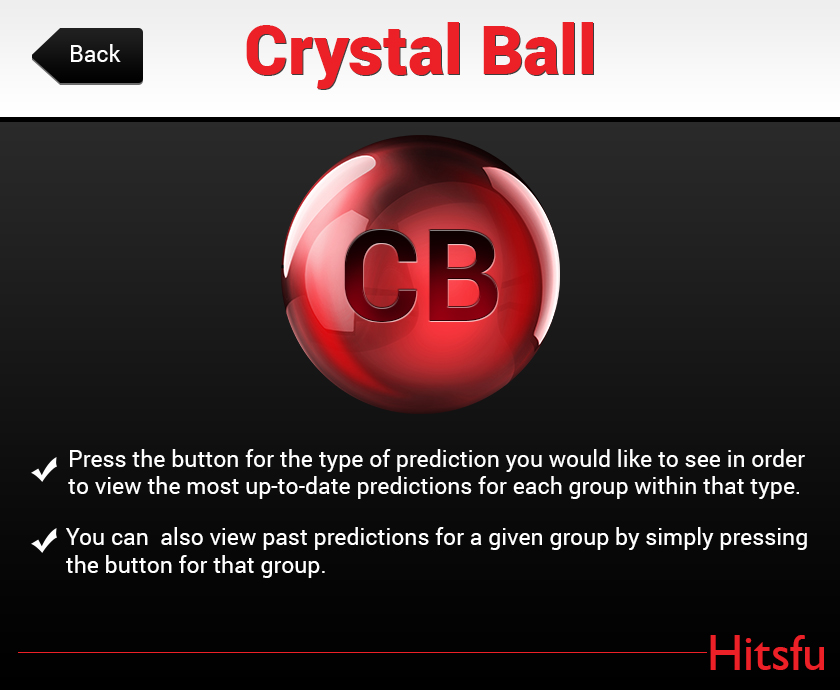
I have built a mobile app using flex that shows charts based on some selections. It has 2 screens (Attached), the slash screen and the graphs screen. I also attached the photoshop file for the splash screen. The company name is "Hitsfu", the product name is "Crystal Ball"
I need to take the design to the next level as far as professionalism. The look should match some top analytics companies products. It should exude precision and professionalism.
Most rework will be done with the splash screen (photo shop attached). The splash screen is a 840 by 690) png that contains the instruction text as well as the Product logo and company logo.
Specific deliverables in order (feel free to do only the top 3, bonus points for the others):
1. Product Icon for "Crystal Ball". The current icon being used is just a place holder (on the splash screen). We need something simple that will work in both the splash screen and to launch the application.
It should be this image: http://www.psdgraphics.com/file/red-sphere.jpg
with a white "CB" inside of it.
2. Company Logo for Hitsfu. The current font being used works ok, but maybe something with more flare. Whatever you come up with should be in the splash screen.
3. Better placement / font selection / font size for the instructions. Maybe a box around each instruction as well. Feel free to kill the carrots/arrows.
4. Font selection: Which font family/ size/ color would you recommend for each text outside of the splash screen.
5. Button shape/color changes: Whats a better look for the list buttons or back button. If you make a change here I need pngs for the up and selected state.
Aktualisierungen
trying to make the brief as concrete as possible, let me know what you think!
Added Thursday, October 30, 2014
Found a Cool image for Crystal Ball Logo. http://www.psdgraphics.com/file/red-sphere.jpg
No clear winner yet, I'd love to see some drafts this weekend :)
Please read updated spec.
Added Saturday, November 01, 2014
Zielmarkt/( -märkte)
executives at companies that develop games or freemium apps
Industrie/Einheitstyp
Shop
Zu verwendende Schriftarten
Farben
Vom Kunden ausgewählte Farben für das Logo Design:
Sehen und fühlen
Jeder Schieber zeichnet eine der Charakteristiken der Marke des Kunden aus sowie den Stil, den euer Logo widerspiegeln sollte.
Elegant
Fett
Spielerisch
Ernst
Traditionel
Modern
Sympatisch
Professionell
Feminin
Männlich
Bunt
Konservativ
Wirtschaftlich
Gehobenes
Anforderungen
Muss haben
- Must look clean / professional. Product logo, company logo, new splash page.
Schön zu haben
- font selections