

 Aktualisieren
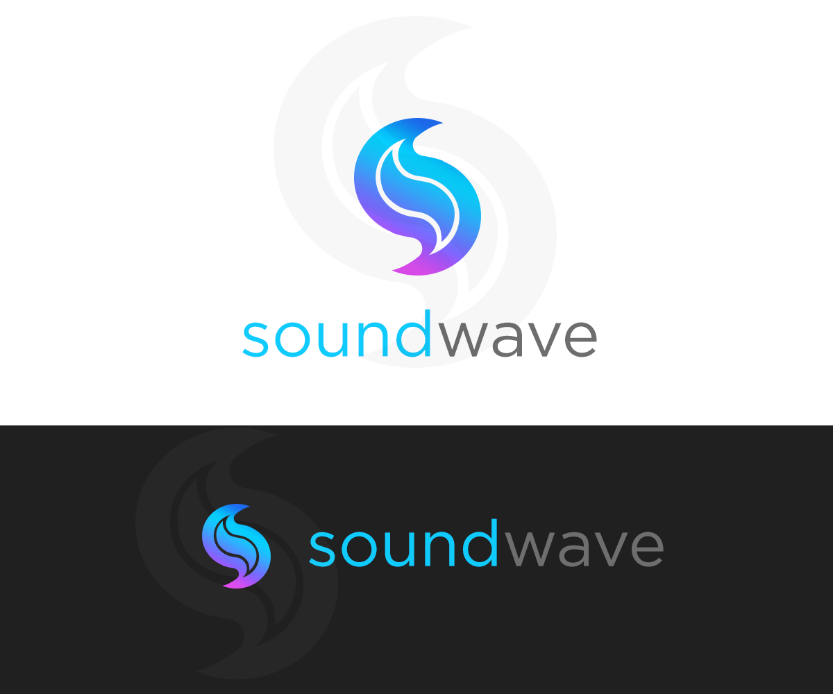
Logo for Media Player Mobile Application
Gewinner
Wollen Sie auch einen Job wie diesen gewinnen?
Dieser Kunde bekam 37 Logo-Designs von 18 Designern. Dabei wurde dieses Logo-Design Design von mxv.design als Gewinner ausgewählt.
Kostenlos anmelden Design Jobs finden
- Garantiert
-
 C$150
-
 37 Designs
-
 18 Designer
Logo-Design Kurzbeschreibung
Hi,
I am a undergraduate student developer working on a personal side project. The mobile application I am building is essentially a social media app that lets users share music, currently just for Android. I have the logic built, however I am not very skilled at graphic design and would like help of a professional for a more polished set of graphics.
Thank you for taking the time and reading through my essay. If you have any questions, please don't hesitate to ask.
Industrie/Einheitstyp
Media
Logo Text
soundwave
Sehen und fühlen
Jeder Schieber zeichnet eine der Charakteristiken der Marke des Kunden aus sowie den Stil, den euer Logo widerspiegeln sollte.
Elegant
Fett
Spielerisch
Ernst
Traditionel
Modern
Sympatisch
Professionell
Feminin
Männlich
Bunt
Konservativ
Wirtschaftlich
Gehobenes
Anforderungen
Muss haben
- - graphics in vector format so I could resize as needed
- - I would like the graphics to stick with the app theme of red and black, white and grey is good too
- - would like an urban/clubbing/partying feel to the app; something "cool"
- - 1 (1024w x 500h px) feature graphic: This should include both the logo and the title; preferably on a white background but any other colour if you can make it appealing.
- - 1 (180w x 120h px) feature graphic; identical to above just with this size constraint
- - 1 (512 x 512 px ) high-res icon: This should be just the logo
- - 1 file of just the resizeable title (for in app use)
- - title: really up to the designer, prefer all caps (see File 1) or all lower case (see File 4) while being elegant and simplistic
Schön zu haben
- Attached examples for design considerations:
- Files 1/2 are the logo's that I am currently using however I feel like some changes need to be made (if you plan on altering it instead of something brand new):
- - i like the font type in File 1
- - i did like the transparency in between each of the "volume indicators"
- - i did like that it is easy for users to guess its relation to music
- - didn't like that it was generally smaller than other icons on the market... I was working with a jpeg image I found online which I photoshopped..so I couldn't get it to scale up properly without getting sides cut off and hence stuck with a smaller version
- - didn't like how the icon was too dark; need something a bit more visible but not too bright either (something similar to: https://play.google.com/store/apps/details?id=com.applic8.beats&hl=en)
- - the number of volume indicators/height/width can all be changed/re-arranged as long as the designer thinks its appealing
- File 3: I like the font choice here, simplistic
- File 4: I like the simplicity of the beats logo as well as the font choice again
Dateien
Alle Dateien herunterladen - 0,3 MBPNG
sound-waves-logo-decal1 Thursday, 16 October 2014 21:26:18

Freitag, 17. Oktober 2014
PNG
ic_logo Thursday, 16 October 2014 21:26:56

Freitag, 17. Oktober 2014
PNG
livestream Thursday, 16 October 2014 21:27:49

Freitag, 17. Oktober 2014
JPG
beats-audio-logo Thursday, 16 October 2014 21:29:47

Freitag, 17. Oktober 2014
Zahlungen
1. Platz
C$150