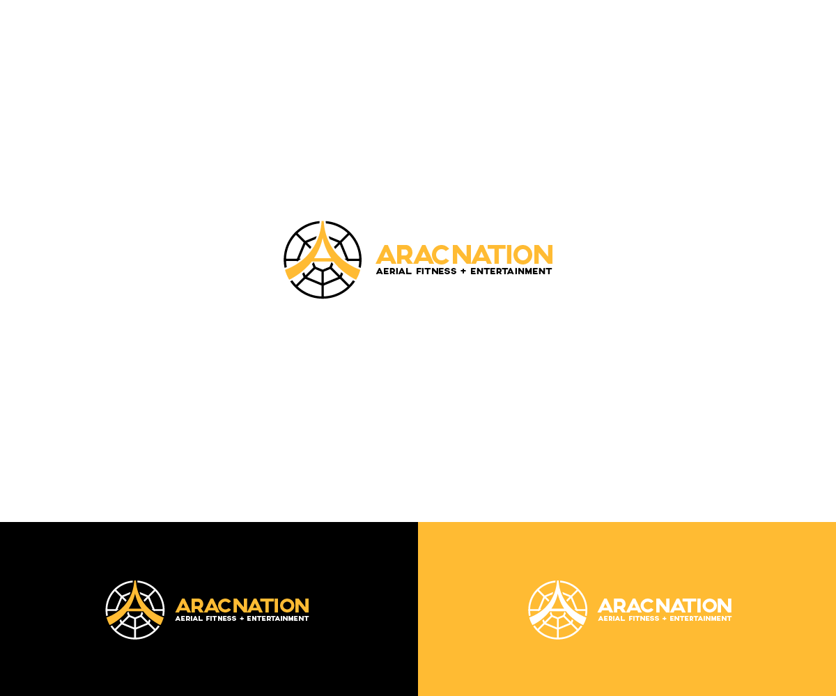
Aracnation Logo Design
Wollen Sie auch einen Job wie diesen gewinnen?
Dieser Kunde bekam 38 Logo-Designs von 20 Designern. Dabei wurde dieses Logo-Design Design von Ash als Gewinner ausgewählt.
Kostenlos anmelden Design Jobs finden- Garantiert
-
 NZ$340
-
 38 Designs
-
 20 Designer
Logo-Design Kurzbeschreibung
My business teaches Aerial apparatus incl Aerial Silks and Aerial Hoop. I also provide performances in Aerial apparatus, hence the entertainment side of the business. I do want to franchise and grow and expand to selling aerial wear and aerial gear.
I have a strong connection to spiders - that is why it is called Aracnation (Arac - coming from Arachne (greek mythology) and (nation - taking over the nation). I want the logo to be strong and represent what my company stands for. Yet i want it to be simple, appealing, modern and geometrical. Initially i have thought black and white but would like to have variations (gold yellow, pink coral, pink) I am a huge fan of pastels but not sure if they represent the boldness i need.
I want the logo to be of circular shape representing a spiderweb with and A inside to look like fabric, I can upload a pic. I don't want it to be too obvious as i am a big fan of simplicity. But i do want people to realise it is a spiderweb, see the A and know its fabric.
Aktualisierungen
I have just uploaded 2 more images with more of a vision - hoping the A would look more like drapes separated if possible. The Aracnation company name can be centered down the bottom
Added Thursday, October 30, 2014
Thank you to all those that submitted designs - I have chosen the best most simplistic one that aligns with my brand.
Added Wednesday, November 12, 2014
Zielmarkt/( -märkte)
The aerial fitness side of the business is predominately women 14-40. But the aerial entertainment side is targeted towards corporate business.
Industrie/Einheitstyp
Entertainment
Logo Text
Aracnation, Aerial Fitness, Aerial Entertainment, EVER WISHED YOU COULD FLY? Silks for life
Logo Stile, die Sie interessieren können
Pictorial / Combination-Logo
Ein reales Objekt (Text optional)
Zu verwendende Schriftarten
Farben
Vom Kunden ausgewählte Farben für das Logo Design:
Sehen und fühlen
Jeder Schieber zeichnet eine der Charakteristiken der Marke des Kunden aus sowie den Stil, den euer Logo widerspiegeln sollte.
Elegant
Fett
Spielerisch
Ernst
Traditionel
Modern
Sympatisch
Professionell
Feminin
Männlich
Bunt
Konservativ
Wirtschaftlich
Gehobenes
Anforderungen
Schön zu haben
- Logo to either be black and white, but can have colour variations. Circular shape indicating a spider web/dream catcher with an A, I would like to have the A looking like 2 pieces of fabric (like in the sketch). Whilst the portrayal of the spider web can also have geometrical layers to it.