Top Construction Software Co Needs a New Magazine Ad Design for 2013
Wollen Sie auch einen Job wie diesen gewinnen?
Dieser Kunde bekam 72 Werbung-Designs von 10 Designern. Dabei wurde dieses Werbung-Design Design von Purple Hearts als Gewinner ausgewählt.
Kostenlos anmelden Design Jobs finden- Garantiert
-
 US$640
-
 72 Designs
-
 10 Designer
Werbe-Design Kurzbeschreibung
Founded in 1986, HCSS is the market leader for innovative software solutions for the heavy civil construction industry. Our suite of products, including the bestsellers HeavyBid® and HeavyJob®, are used by more than 40,000 workers every day to improve their proficiency at estimating, job management, resource management, safety and equipment maintenance. HCSS also offers new mobile applications and cloud computing services so companies can work on a wide array of devices including laptops, tablets and smartphones.
In addition to high quality software, HCSS is best known for providing world-class customer service, and for its friendly, employee-ownership culture. We offer a full range of professional support options to help customers maximize their software investment including implementation planning, training and INSTANT 24/7 phone support.
Project description
We are creating a new magazine ad campaign for 2013 and need a full page and 1/3 page ad for this campaign.
The ad concept is Work Smarter, and we will provide 1 tip in each ad along with a case study of how a construction company can work smarter this year to save money, be more efficient or profitable.
Each ad will feature a "Work Smarter Tip # xx" headline, a sub-heading that contains the actual tip, a construction image that relates to the tip, a case study with bullet points about a company that has done the tip successfully and the results, an offer to download a free report with all of our 40 Work Smarter tips from a landing page, and our logo with branding elements.
The ad will typically run as a 1/3 page ad approximately 4" x 5", but we would like both a full page and 1/3 page design for the ad.
HCSS Brand personality traits - Innovative, market leader, competent, professional, masculine, friendly, and helpful. We've been in business for 27 years, and we are known for our world-class customer support and friendly helpful employees.
Aktualisierungen
I've added a new logo file that has a square logo and a horizontal logo. You can use either in the ad.
Added Thursday, January 17, 2013
The text in the case study is a little long, and everyone seems to have a little trouble fitting it in the design. Feel free to cut the last 2 or 3 bullets in your design, and I will make the text work with the size you give me.
Added Saturday, January 19, 2013
Zielmarkt/( -märkte)
Construction company executives, estimators, project managers, equipment managers, and IT support. We mainly target US and Canadian customers.
Industrie/Einheitstyp
Construction
Sehen und fühlen
Jeder Schieber zeichnet eine der Charakteristiken der Marke des Kunden aus sowie den Stil, den euer Logo widerspiegeln sollte.
Elegant
Fett
Spielerisch
Ernst
Traditionel
Modern
Sympatisch
Professionell
Feminin
Männlich
Bunt
Konservativ
Wirtschaftlich
Gehobenes
Anforderungen
Muss haben
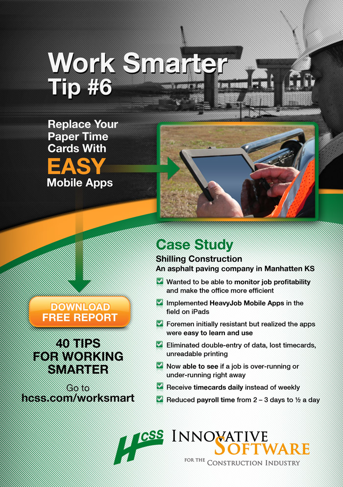
- Ad title- "Work Smarter Tip #6"
Tip- Replace paper timecards with easy mobile apps
Image- Construction image related to the tip. Would like the tip potentially on the image, but open to suggestions. Just need the ad to be eye-catching to readers.
Case Study - Provide a case study of a company that implemented the tip with their results. This needs to be easy to read, and stand out from the ad.
Logo - Must use our company logo and it should be very visible.
Free Report - Want a strong call-to-action offer for the free report. See the attached word document for the copywriting for the ad elements.
Very important - the ad must be eye-catching. Something that will make readers want to read the tip while breezing through a magazine, while still being professional and matching our branding elements. Call to Action for free report should also be very visible.
Brand colors - Green PMS 356 and black are our dominant colors, can use yellow and orange (C=0, M=48, Y=98, K=0) as accent colors.
Schön zu haben
- We want to be viewed as helpful, industry leader, professional.
I attached a .pdf document of an ad created by a graphic designer that is good, but we are willing to pay to get more creative designs. The .pdf shows basically what we are looking for, but would like more creativity and something that will stop readers. Also, the designer changed our logo which we don't like so use the attached logo.
Sollte nicht haben
- Feminine design - our industry is largely male construction workers.
Don't use script or goofy fonts
Don't change the logo, or put it in an image where it is not easily viewable.
Don't do something that is unprofessional like show a naked woman, etc.