Headway Hockey
Wollen Sie auch einen Job wie diesen gewinnen?
Dieser Kunde bekam 75 Logo-Designs von 15 Designern. Dabei wurde dieses Logo-Design Design von JohnnyMacK als Gewinner ausgewählt.
Kostenlos anmelden Design Jobs finden-
 C$160
C$160
-
 75 Designs
-
 15 Designer
Logo-Design Kurzbeschreibung
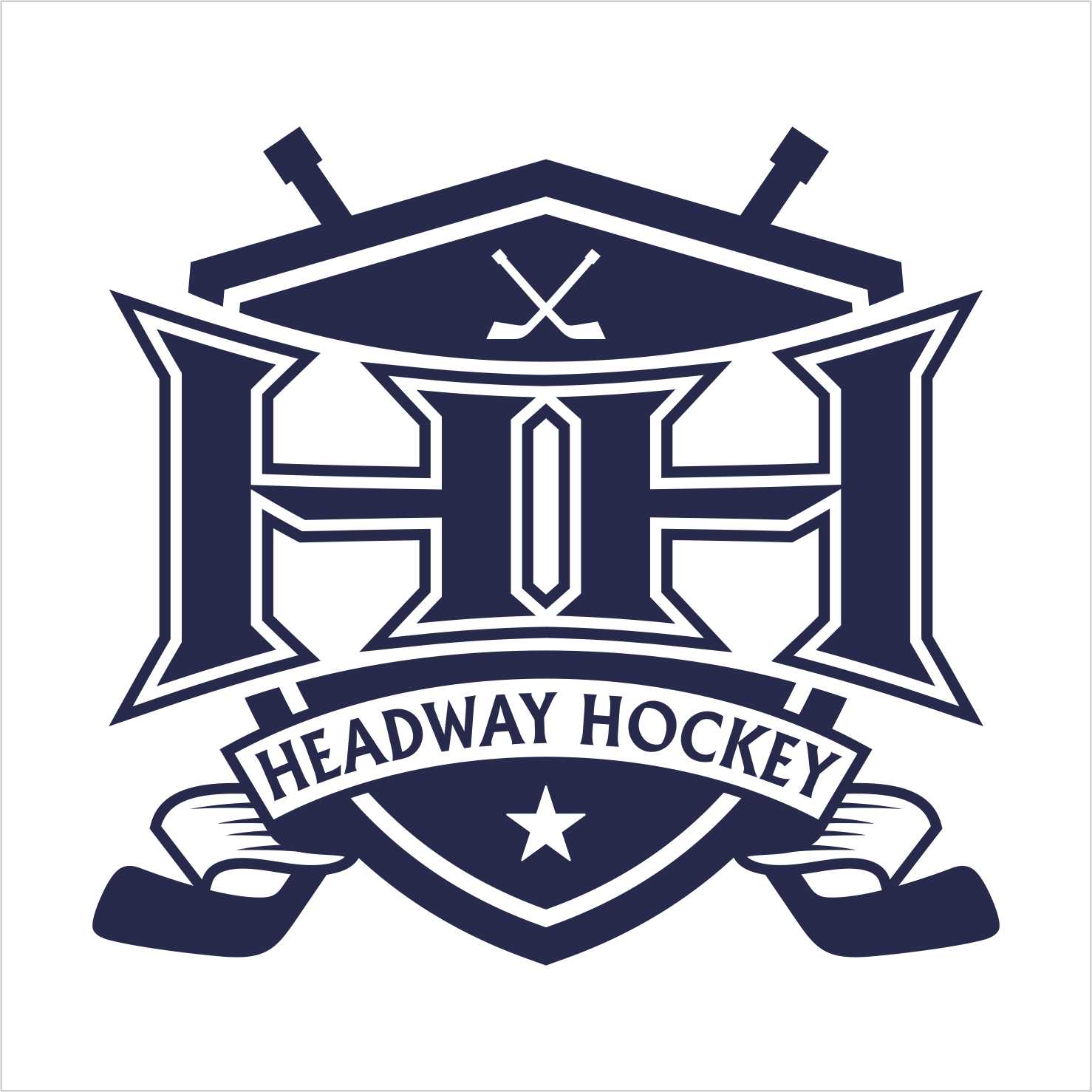
Headway Hockey is a revolutionary summer program for elite hockey players to advance their ice skating and overall skill set. The reason I chose “Headway Hockey” for my company name is because I want to grow hockey training and summer skating to the point where players never feel like they are plateauing, they are always making “Headway.” My company is based out of Vancouver but am planning on going international throw online tutorial videos, the internet and social media. I envision my logo to be powerful, masculine, playing off the double “H” with possibly a hockey stick incorporated somewhere in the logo. Think of the Under Armor logo and New York Yankees logo. I really like how the letters are intertwined in both of these. The main use for the logo is that it will be applied on hockey jerseys, so think of NHL logos. I like the vintage looking logos that have circles around them like the New York Islanders. I want the "HH" inside the circle with "Headway Hockey" either written on the outside or inside but smaller. My logo will be on everything; my website, business cards, tracksuits, hockey jerseys, hats and social media. Blue is the main color I am thinking as either an accent or the entire logo. The color blue is the signal for strength and that is what I want my company and my logo to stand for. Other words that come to mind when envisioning the Headway Hockey logo are growth and strong. My company is not just like every other summer hockey camp. We are going to have our webpage up and running very soon and want the logo to be a focal point. Headway Hockey isn’t just the name of a company we want it to become a brand with merchandise, blogs, videos and social media.
I uploaded some more images to reference. A circle within my logo is not set in stone you can use other shapes to get the vintage point across. Also it is my goal to get my players to the NHL and it should be their goal as well so maybe if you can incorporate the NHL logo into the design that would work as well. I still want rich, masculine colors so do not go with the vintage looking etched out colors i just wanted to get the point across that there can be more shapes that look vintage.
Aktualisierungen
All I liken about the New York Islanders logo is that it is vintage. I like how the under armor and yankees logo are both masculine and the letters are intertwined. And i do not want the word "smaller" in the logo just in a smaller font/graphic above or under the "HH" for it to say Headway Hockey.
Added Wednesday, November 12, 2014
I uploaded some more images to reference. A circle within my logo is not set in stone you can use other shapes to get the vintage point across. Also it is my goal to get my players to the NHL and it should be their goal as well so maybe if you can incorporate the NHL logo into the design that would work as well. I still want rich, masculine colors so do not go with the vintage looking etched out colors i just wanted to get the point across that there can be more shapes that look vintage.
Added Wednesday, November 12, 2014
I uploaded a new logo that I want to see be used in one way or another. It is the Eagleridge mortorcycle rental logo. I want the same shape of that logo with the banner saying Headway Hockey. You can try some various fonts and forms of the double "HH" inside the diamond like shape. feel free to use any colors as long as it is masculine looking im okay with that. Let me know if you have any questions.
wade
Added Tuesday, November 18, 2014
Project Deadline Extended
Reason: Headway Hockey logo
Added Wednesday, December 03, 2014
Industrie/Einheitstyp
Training
Logo Text
HH (Headway Hockey) *smaller font/graphic
Farben
Vom Kunden ausgewählte Farben für das Logo Design:
Sehen und fühlen
Jeder Schieber zeichnet eine der Charakteristiken der Marke des Kunden aus sowie den Stil, den euer Logo widerspiegeln sollte.
Elegant
Fett
Spielerisch
Ernst
Traditionel
Modern
Sympatisch
Professionell
Feminin
Männlich
Bunt
Konservativ
Wirtschaftlich
Gehobenes
Anforderungen
Muss haben
- HH