Company/Software Logo
Wollen Sie auch einen Job wie diesen gewinnen?
Dieser Kunde bekam 226 Logo-Designs von 48 Designern. Dabei wurde dieses Logo-Design Design von MrBranding als Gewinner ausgewählt.
Kostenlos anmelden Design Jobs finden- Garantiert
-
 US$220
-
 226 Designs
-
 48 Designer
Logo-Design Kurzbeschreibung
** First of all, thank you in advance for your entries. You will be playing a big part of launching my first project and I appreciate the effort that goes into making a logo. Below, I will try to be as specific as possible to give you the best idea of what I am looking for.**
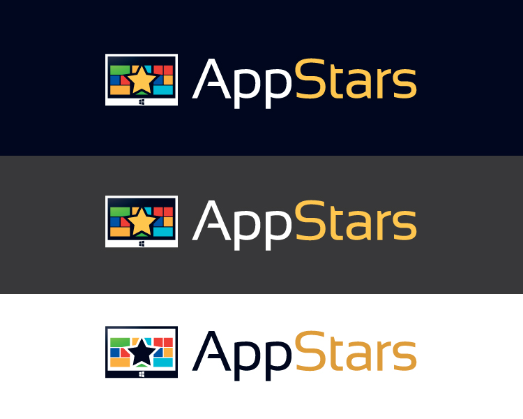
App Stars is a service which allows users to find great Windows 8/Windows RT apps. The apps are stars because they represent the best and brightest of whats available! You could say that of all the apps, they shine the brightest...like stars in the sky. Or you could say they are stars because they should and will gain popularity with the masses...like the star of a Hollywood show.
I'm looking for a modern, clean logo which incorporates modern, clean typography (some nice examples: http://webdesignledger.com/freebies/20-super-clean-fonts-perfect-for-minimal-style-design) and eye catching detailed graphics.
I like bold colors and contrast :).
Here are some examples of logos I like on this site. They use clean fonts and simple graphics/illustrations/iconography which are relevant to the product names. I would be very happy to end up something along those lines:
http://www.designcrowd.com/design/63420
http://www.designcrowd.com/design/1334615/
http://www.designcrowd.com/design/788046/
http://www.designcrowd.com/design/582056
http://www.designcrowd.com/design/1341776/
http://www.designcrowd.com/design/903737/
http://www.designcrowd.com/design/589449/
http://www.designcrowd.com/design/1053041/
What I DO NOT Want:
I DO NOT want a logo that looks like it was designed specifically for an app, I want a logo that looks like a company, product, or brand logo.
That means please don't incorporate a mobile phone or confine the app to a square or a rounded square which looks like an icon on an iphone or tablet. I also want a logo, not an icon. However, incorporating stars and the depiction of an app/apps within the context of the logo is OK. Hopefully, the distinction is clear. To help, here are some logo designs that I do not like for the very reason state above (you can easily tell the logo is for an app):
http://www.designcrowd.com/design/843227
http://www.designcrowd.com/design/839676
Finally, these are examples and guidelines but my goal is NOT to design creativity. If you have something in mind that you think would be perfect, go for it, even if it does not totally match what I think I want.
Aktualisierungen
The logos that I linked as ones that I like in the project description are really nice. Please spend a little time reviewing those and using them as a guide when coming up with your submissions.
Thanks again in advance for all your submissions!
Added Saturday, January 26, 2013
Added a couple attachments. They are samples of what the Windows 8 start screen looks like with all the app tiles (squares and rectangles). A possible option is to incorporate this into the design. It could be represented by a rectangular outline with square and rectangle blocks of different sizes and colors inside. On a small scale, just simply lines shapes and color. That could be a good presentation of the apps side of it...to go along with the stars.
Added Sunday, January 27, 2013
Added an image (windowsphonestartscreen) to illustrate what I meant in the last update. That one is of a Windows Phone screen but the only difference is that for Windows 8, there are no back and search buttons (only the windows button), there should be no line for the ear speaker at the top, and it should be in landscape with the start button still at the bottom in the middle.
Added Sunday, January 27, 2013
Based on my confidence in the designers, I have made this project guaranteed! Thank you very much for your hard work.
Added Sunday, January 27, 2013
** THANK YOU ALL DESIGNERS **
As recommended by DesignCrowd, I will wait until after the project deadline to make the design selection. However, I'd like to take the opportunity now to say thank you to all designers who made submissions for the project. I've been overwhelmed (in a positive manner) with the response.
I've tried to eliminate designs what I would not have considered. The remaining 15 designs represent what I consider to be the top designs (out of 200+) for this project. A special thanks to the designers of these 15. I would be very proud to use any of these.
Thanks again for making this a great experience for me!
Added Friday, February 01, 2013
Zielmarkt/( -märkte)
Window 8 early adopters...largely age 20-35
Industrie/Einheitstyp
It Company
Logo Text
App Stars
Logo Stile, die Sie interessieren können
Emblem-Logo
Logo eingeschlossen in einer Form
Pictorial / Combination-Logo
Ein reales Objekt (Text optional)
Abstraktes Logo
Begrifflich / symbolisch (Text optional)
Figuren-Logo
Logo mit Abbildung oder Zeichen
Sehen und fühlen
Jeder Schieber zeichnet eine der Charakteristiken der Marke des Kunden aus sowie den Stil, den euer Logo widerspiegeln sollte.
Elegant
Fett
Spielerisch
Ernst
Traditionel
Modern
Sympatisch
Professionell
Feminin
Männlich
Bunt
Konservativ
Wirtschaftlich
Gehobenes
Anforderungen
Muss haben
- Must Have: Clean (see font and logo examples above), San Serif fonts, Use of Color, The product name
Must Not Have: Logo that looks like it was obviously designed for an app, logo that looks like an app icon.
Schön zu haben
- - Prefer clean, simple 2D graphics (see logos linked in the description)
Sollte nicht haben
- - No icon looking logos
- No logos that look like they are obviously made for an app
- No text only logos