Survival equipment outfitters’ web store and main product line needs clean logo design
Wollen Sie auch einen Job wie diesen gewinnen?
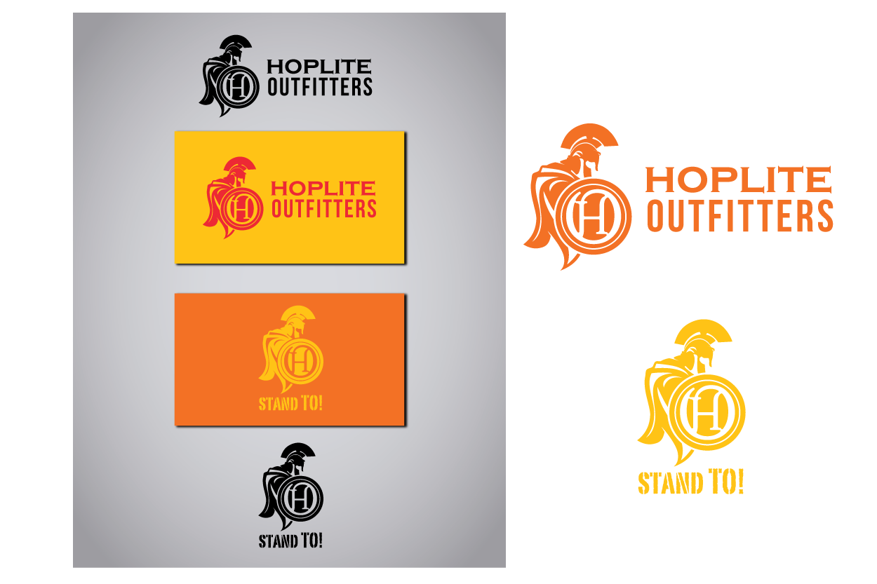
Dieser Kunde bekam 43 Logo-Designs von 21 Designern. Dabei wurde dieses Logo-Design Design von Mandy Illustrator als Gewinner ausgewählt.
Kostenlos anmelden Design Jobs finden- Garantiert
-
 US$175
-
 43 Designs
-
 21 Designer
Logo-Design Kurzbeschreibung
- INTRO: Please read our statement carefully, as we are a lean startup with intent to establish an ongoing working relationship with a preferred graphic designer as our business grows. We have guaranteed payment for this job with intent to receive an enduring design of professional quality, with the selected artist becoming our “go-to” designer of choice for future branding work. Furthermore, we will credit your design work on our web site in a “credits/details” section. In this case, we favor high quality over speed of delivery and are available to answer questions and work on drafts.
- BRAND AND PURPOSE: Our web store is called "Hoplite Outfitters”. Our main line of products is branded as "Stand TO!” We prefer a logo that can be paired with text delineating both “Hoplite Outfitters” and “Stand TO!” brands with minor variations between the two, or having carefully designed common visual cues that show a close relationship. Our Hoplite Outfitters storefront and Stand TO! brand markets camping, survival, and disaster preparedness equipment.
- VISUAL INSPIRATIONS: We have in mind artwork that depicts a stylized/simplified form of a traditional Greek hoplite shield, perhaps paired with a figure and/or spear. We need these inspirations distilled down to essential visual cues and avoid appearing too much like a high school mascot or cartoon. For the Hoplite Outfitters text, we envision a font and texture that is memorable and flexible for on-screen use. For the “Stand TO!” text, we are open to professional input on presentation and style. We have imagined the word “Stand” featuring small caps so the whole phrase has a strong balanced appearance.
- COLORS: Composition must be kept to a few colors; in addition to appearing our web site, we envision being able to embroider or screen a version of the logo on cloth items. We prefer strong colors that can provide immediate brand recognition, for example, black gold, and crimson.
- FEELINGS/EMOTIONS: Our logo must convey strength, protection, and readiness, and above all else be immediately recognizable. Simplicity of design is important to allow for versatility of application (web page, screen print, embroidery) without looking cartoonish.
- CONCLUSION: We hope you view the above info as general guidelines and not as hard barriers. We look forward to seeing creative and innovative submissions, and are willing to work through drafts and iterations so we can get it right.
Aktualisierungen
We want to remind all designers that we are available to answer questions and work on drafts! We are willing to work through drafts and iterations in order to get this right. Added Wednesday, November 26, 2014
Zielmarkt/( -märkte)
US consumers looking for camping and survival equipment.
Industrie/Einheitstyp
Graphic Designer
Logo Text
Hoplite Outfitters
Logo Stile, die Sie interessieren können
Pictorial / Combination-Logo
Ein reales Objekt (Text optional)
Abstraktes Logo
Begrifflich / symbolisch (Text optional)
Zu verwendende Schriftarten
Andere Schriftarten erwünscht:
- Semi serif preferred
Farben
Vom Kunden ausgewählte Farben für das Logo Design:
Sehen und fühlen
Jeder Schieber zeichnet eine der Charakteristiken der Marke des Kunden aus sowie den Stil, den euer Logo widerspiegeln sollte.
Elegant
Fett
Spielerisch
Ernst
Traditionel
Modern
Sympatisch
Professionell
Feminin
Männlich
Bunt
Konservativ
Wirtschaftlich
Gehobenes
Anforderungen
Muss haben
- A strong and clean appearance, along with visual coherence between text and symbols. Design should work on a web page, screen print, or embroidery. The logo should look good on a patch, so its boundary should be circular. or it should at least look good when placed in a circular boundary.
Sollte nicht haben
- Should not have too many colors. Should not look like a cartoon. The colors and look/feel as presented by the DesignCrowd interface are general guidelines. We are a bit constrained by this interface and look forward to working together to share information and expectations.