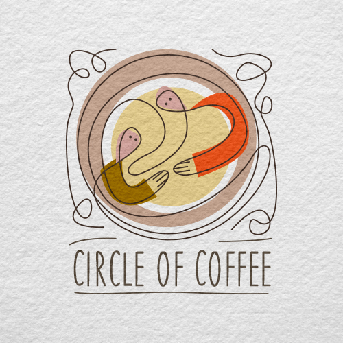
Coffee Company Logo Design "Circle Of Coffee"
Wollen Sie auch einen Job wie diesen gewinnen?
Dieser Kunde bekam 89 Logo-Designs von 39 Designern. Dabei wurde dieses Logo-Design Design von Rick Castelán Mayorga als Gewinner ausgewählt.
Kostenlos anmelden Design Jobs finden-
 US$285
-
 89 Designs
-
 39 Designer
Logo-Design Kurzbeschreibung
We are a startup internet-based company that will be offering a variety of products to consumers, including coffee novelties and gifts, microroasted coffee, coffee accessories, and a branded line of other coffee related products. We will also be building a platform to host what we hope will become the largest online community for coffee lovers in the world. Our company name, Circle Of Coffee, has many subtleties in its meaning. The "circle" is a place where people come together to connect and share their passion for coffee and for life. We are looking for a contemporary and fresh design -- clean, colorful, and even a little unpredictable (and not necessarily in the shape of a circle). The logo should be tasteful, and not overly stylized or "busy".
Zielmarkt/( -märkte)
Anyone who enjoys coffee and purchases coffee or related products online.
Industrie/Einheitstyp
Building
Logo Text
Circle of Coffee (with TM trademark symbol)
Logo Stile, die Sie interessieren können
Figuren-Logo
Logo mit Abbildung oder Zeichen
Zu verwendende Schriftarten
Sehen und fühlen
Jeder Schieber zeichnet eine der Charakteristiken der Marke des Kunden aus sowie den Stil, den euer Logo widerspiegeln sollte.
Elegant
Fett
Spielerisch
Ernst
Traditionel
Modern
Sympatisch
Professionell
Feminin
Männlich
Bunt
Konservativ
Wirtschaftlich
Gehobenes
Anforderungen
Muss haben
- Colorful. Please do not emphasize the color brown, or black and white. The ideal design would be bright, cheerful, casual, clean, contemporary, and contain multiple colors. Please see uploaded files for color examples. Please see additional files for examples of logos that I like (I am not looking to duplicate these, they are just for reference). Please Include company name with trademark symbol.
Schön zu haben
- Some type of simple graphic/illustration in addition to the text.
Sollte nicht haben
- Boring clip art. Too much emphasis on a circular design. Please do not include any text other than the company name and trademark symbol.