Header/Logo Redesign
Wollen Sie auch einen Job wie diesen gewinnen?
Dieser Kunde bekam 95 Web-Designs von 21 Designern. Dabei wurde dieses Web-Design Design von JB als Gewinner ausgewählt.
Kostenlos anmelden Design Jobs finden- Garantiert
-
 US$500
-
 95 Designs
-
 21 Designer
Web-Design Kurzbeschreibung
****WE HAVE FOUND THE DESIGNER WHO WILL BE HANDLING THIS PROJECT. PLEASE DONT SUBMIT ANY MORE DESIGNS.****
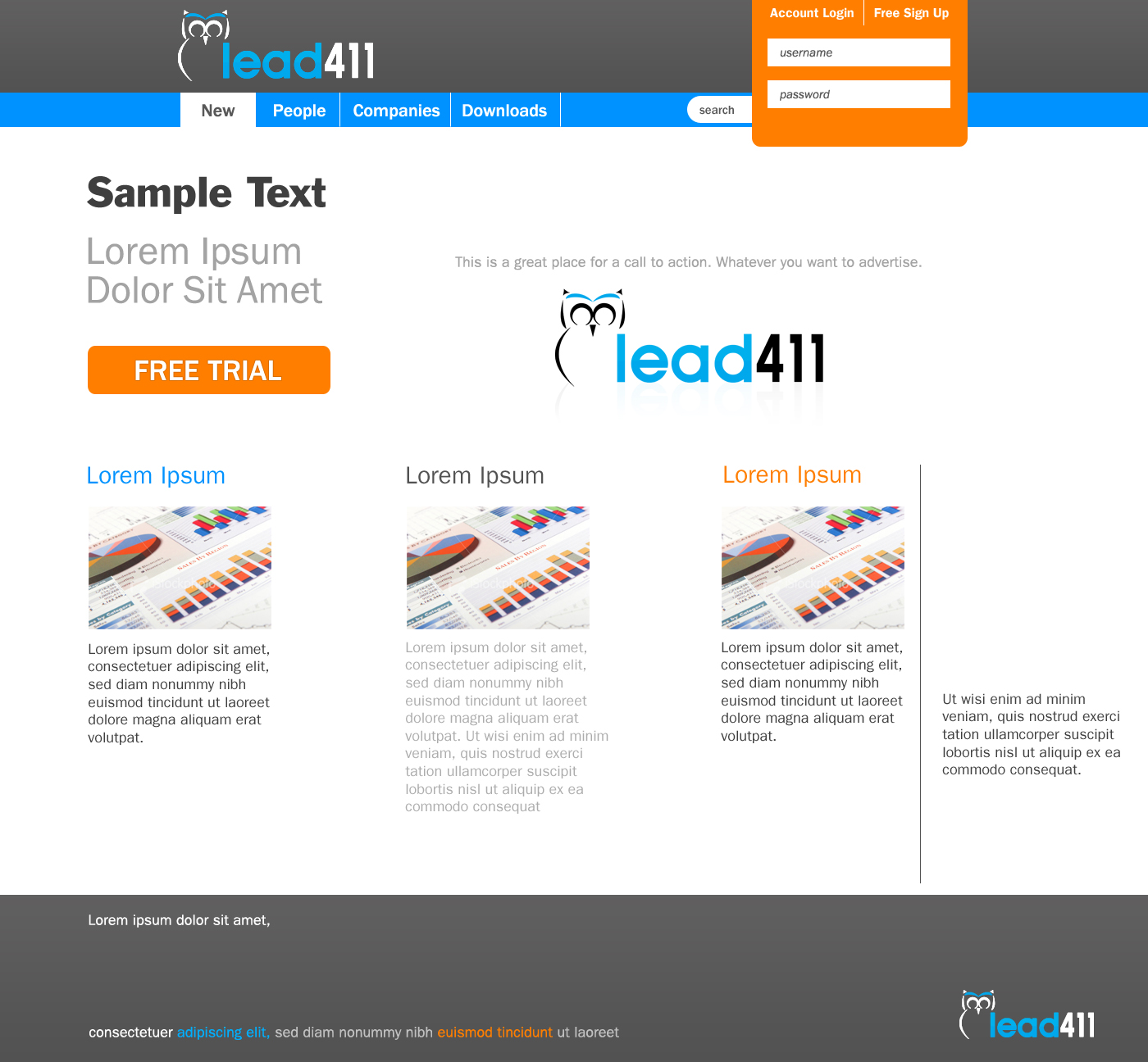
We have been working with a Web/Logo Designer on a new header and logo for our site. We like some of it, but other things need changing.
Overall Look: We are looking for something that is professional, yet still fresh. Most business two business websites seem old fashinoned. The site we like most is www.expensecloud.com.
Header Thoughts:
-We like the color at the top of the header. The light purple on the menu bar is a little dull though. It seems to be grayed out too much. Notice the pop that www.expensecloud.com has. We need that pop.
-The fonts on the menu bar don't pop either. I don't know if it is because the font is bad or the thickness of the font is bad or what.
-We are not sold on the green color in the logo and header. It is pretty good, but maybe we can test other colors?
Logo Thoughts:
-I am not sold on the green color. It is pretty good, but maybe test it out with some other colors?
-The logo does not pop like the www.expensecloud.com logo pops.
-We had started thinking about doing an owl as part of our name/logo or maybe some other type of animal. Look at the ideas I had sent our original graphic designer.
A. http://logopond.com/gallery/detail/113160 - i like that is simple, a little abstract, but I don't like that it is sort of evil.
B. http://logopond.com/gallery/detail/61169 - i like that is abstract.
C. http://webtoolfeed.files.wordpress.com/2012/05/kramnik1.jpg - i like the slightly abstract.
D. http://dribbble.com/shots/353825-O-W-L - good - abrstract and slightly turned.
Zielmarkt/( -märkte)
Sales and Marketing People - primarily a masculine audience in their 20s to 40s.
Industrie/Einheitstyp
Business
Sehen und fühlen
Jeder Schieber zeichnet eine der Charakteristiken der Marke des Kunden aus sowie den Stil, den euer Logo widerspiegeln sollte.