Logo Design for indie rock band
Wollen Sie auch einen Job wie diesen gewinnen?
Dieser Kunde bekam 38 Logo-Designs von 16 Designern. Dabei wurde dieses Logo-Design Design von MrBranding als Gewinner ausgewählt.
Kostenlos anmelden Design Jobs finden-
 US$400
-
 38 Designs
-
 16 Designer
Logo-Design Kurzbeschreibung
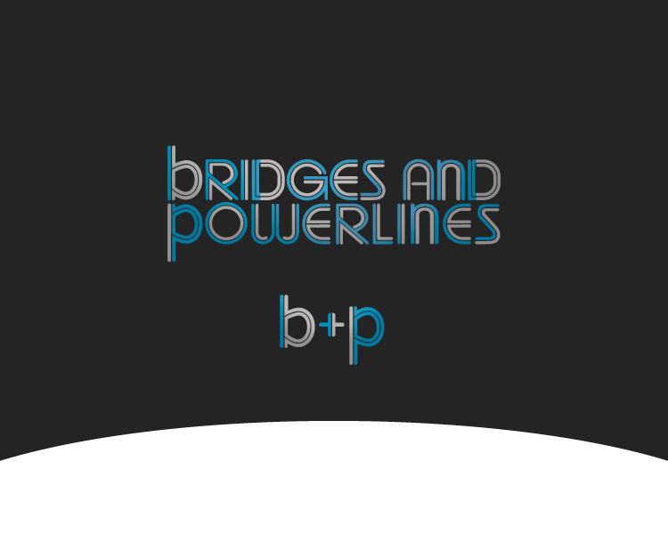
We need a logo for a brooklyn indie rock band called bridges and powerlines. The logo probably should have different colors for each letter, an array of grays, browns and a few more hopeful colors (some faded blues) and should be all lowercase.
would like a wordmark logo using the band name and a separate similar logo with the acronym b & p
the brand image / personality is: honest, hopeful, slightly quirky, somewhat nostalgic
Zielmarkt/( -märkte)
ages 13-40, indie rock crowd (a bit hipster-y)
Logo Text
bridges and powerlines
Logo Stile, die Sie interessieren können
Wortmarke-Logo
Word oder namensbasiertes Logo (nur Text)
Lettermark-Logo
Kurzwort oder Buchstaben-Logo (nur Text)
Sehen und fühlen
Jeder Schieber zeichnet eine der Charakteristiken der Marke des Kunden aus sowie den Stil, den euer Logo widerspiegeln sollte.
Elegant
Fett
Spielerisch
Ernst
Traditionel
Modern
Sympatisch
Professionell
Feminin
Männlich
Bunt
Konservativ
Wirtschaftlich
Gehobenes
Anforderungen
Muss haben
- convey the desired brand image: hopeful, honest, slightly quirky, nostalgic.
use the attached image, really like that design, ideally extremely similar.
the logo must have two things:
a text logo with "bridges and powerlines"
and an acronym logo with "b&p"
the text logo likely should be on two lines aka:
bridges and
powerlines
but not so sure about that.
can check out the music and art (to get a sense) at:
bridgesandpowerlines.com
soundcloud.com/bridgesandpowerlinesband