Personalized Handcrafted Frames Logo Design
Wollen Sie auch einen Job wie diesen gewinnen?
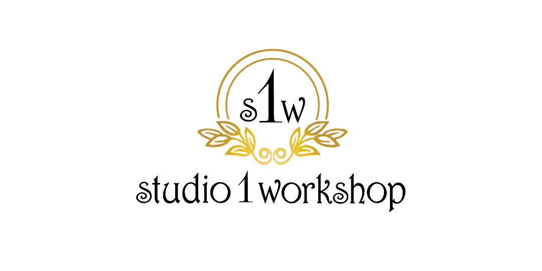
Dieser Kunde bekam 145 Logo-Designs von 12 Designern. Dabei wurde dieses Logo-Design Design von hih7 als Gewinner ausgewählt.
Kostenlos anmelden Design Jobs finden- Garantiert
-
 US$200
-
 145 Designs
-
 12 Designer
Logo-Design Kurzbeschreibung
I am a small business owner based in Westfield Mass. called Studio 1 workshop. I work out of my home with plans to operate online. Studio 1 workshop is a laser engraving business that offers personalization on frames, glassware, plaques, signs, rubberstamps, ect. The majority of my orders is my custom made frames. These frames are cut, lacquered, laser engraved all in my workshop. My online business will only focus on "Birth Frames, Birth plaques, and special occasion frames, mostly centered around infants-children. Eventually I will alter my business to weddings ect. I would like a logo that contains the initials S 1 W with the 1 larger than the s and w. colors nothing too bright. CMYK color C52 M76 Y42 K21 was my first choice Not sure what it is in RGB. I am open for other ideas. Would like logo not to be defined to just children as my business might grow and change. I have designed and choosen the text for my business name. Font Harrington attached is my design
Aktualisierungen
Would like to mention that the "S" in studio and "S" in workshop is the Capital letters in Harrington
Added Tuesday, January 06, 2015
To all designers,
To make things easier, I have uploaded studio 1 workshop image in SVG format and in corel draw
I didn't realize that I originally sent in pdf
I still would like S1W for logo
I would still like to keep the name in Harrington or something very close to it.
The reason why I uploaded image is although it's in Harrington…there was some minor adjustments in the text that I like to keep.
Example…the 3 "o" are actually rotated….. The two "s" are cap BUT sized down to other text.
The request that I would like is to keep the '1' as close to what was uploaded. It was not done in Harrington
I wanted to have the "1" be sharp and defined because some fonts make the '1 'look like 7's or I's
thanks
Added Thursday, January 08, 2015
Theres seems to be a issue with the uploads I have sent.
I hopefully corrected the problem
There should be 4 files. SVG, PDF, PSD, and Corel draw.
please note that I replaced the corel draw with the most current
Please update me if there is still problems. Thanks again
Added Friday, January 09, 2015
Zielmarkt/( -märkte)
target customers women ages 25 - 55
Industrie/Einheitstyp
Small Business
Logo Text
S 1 W
Logo Stile, die Sie interessieren können
Emblem-Logo
Logo eingeschlossen in einer Form
Lettermark-Logo
Kurzwort oder Buchstaben-Logo (nur Text)
Sehen und fühlen
Jeder Schieber zeichnet eine der Charakteristiken der Marke des Kunden aus sowie den Stil, den euer Logo widerspiegeln sollte.
Elegant
Fett
Spielerisch
Ernst
Traditionel
Modern
Sympatisch
Professionell
Feminin
Männlich
Bunt
Konservativ
Wirtschaftlich
Gehobenes
Anforderungen
Muss haben
- the 1 should be larger than s and w
Schön zu haben
- something that goes with the font Harrington that is used for my business name
Sollte nicht haben
- no bold colors