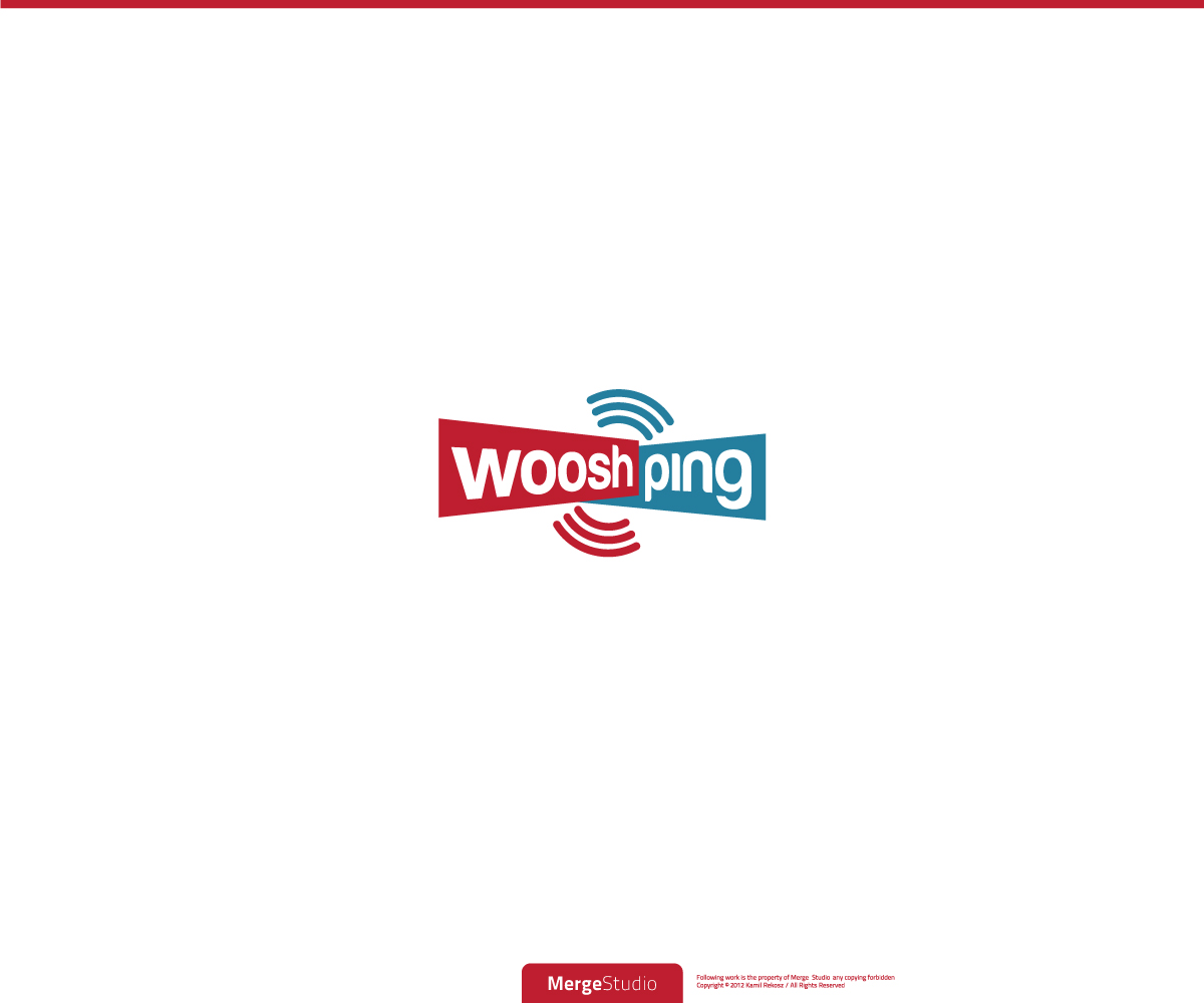
Logo Design Project - rebranding from Tagonic to wooshping
Wollen Sie auch einen Job wie diesen gewinnen?
Dieser Kunde bekam 30 Logo-Designs von 9 Designern. Dabei wurde dieses Logo-Design Design von MergeStudio als Gewinner ausgewählt.
Kostenlos anmelden Design Jobs finden-
 £150
£150
-
 30 Designs
-
 9 Designer
Logo-Design Kurzbeschreibung
This project is for a rebrand of an existing business Tagonic to a new brand wooshping.
We helps businesses implement fun and innovative customer engagement campaigns utilising latest mobile technologies like NFC (Near Field Communications).
NFC enabled posters and collateral allow people to tap their phone against a tag which tells the phone what action to perform. It doesn;t require an app to be downloaded or started before allowing consumers to engage. Campaign types can include, but are by no means restricted to social networking (Like on Facebook, Follow on Twitter, Check in on Foursquare & Facebook, repin on pinterest etc), direct access to app downloads, direct access to content multimedia content (audio / video content), product information, newsletter sign ups, contact forms, interactive business cards etc.
Tagonic provides a cloud-based management platform that provides flexibility of management of campaigns, as well as real-time analytics and reporting of campaigns.
Please check http://www.tagonic.com for further details about the company and a background to NFC and use cases.
The company is now rebranding from "Tagonic" to "wooshping"
The "woosh" relates to the movement of the phone towards the target tag and the "ping" related to the sound the phone makes when scanning an NFC tag.
wooshping is one word. At this moment we are not clear if the w should be lower case of in Caps. Please design as you feel appropriate.
I have come up with a concept of perspective (very rough) which I quite like and would like suggestions on this theme and I have attached it to the brief. I don't know whether it needs an additional image element (like NFC waves) incorporated into the design so I will leave that up to the designers to propose as they see fit. Also, the colours are totally open although I do like the Blue that is on our website at www.wooshping.com
Aktualisierungen
Hi there. Just a quick message to say I have updated the brief and given quite specific direction which I now hope will appeal to you to submit ideas and thoughts around that direction.
Added Wednesday, February 20, 2013
Zielmarkt/( -märkte)
Predominantly businesses (marketeers and product managers) but also consumers who are seeking more information on the subject.
Industrie/Einheitstyp
Business
Logo Text
wooshping
Logo Stile, die Sie interessieren können
Emblem-Logo
Logo eingeschlossen in einer Form
Pictorial / Combination-Logo
Ein reales Objekt (Text optional)
Abstraktes Logo
Begrifflich / symbolisch (Text optional)
Sehen und fühlen
Jeder Schieber zeichnet eine der Charakteristiken der Marke des Kunden aus sowie den Stil, den euer Logo widerspiegeln sollte.