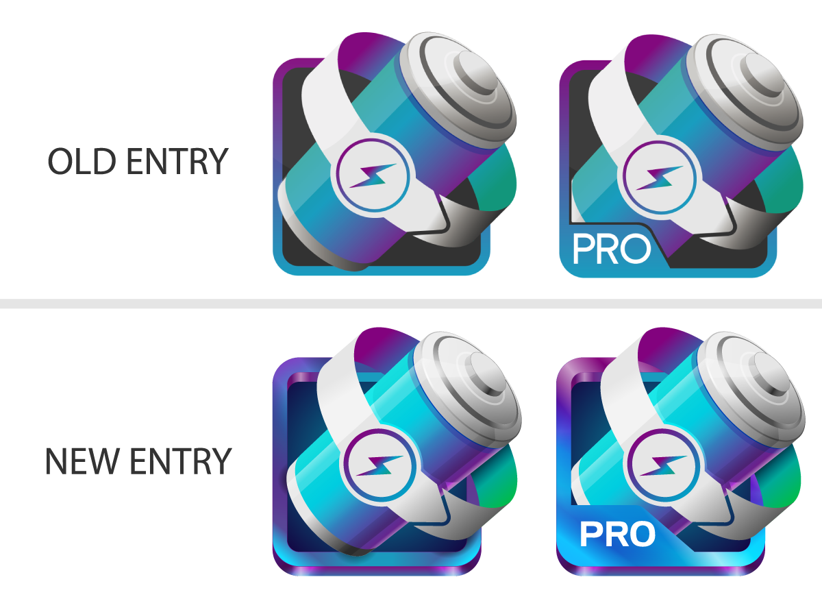
Battery Saver Icon for Android App
Wollen Sie auch einen Job wie diesen gewinnen?
Dieser Kunde bekam 69 Icon-Designs von 32 Designern. Dabei wurde dieses Icon-Design Design von kervzpro als Gewinner ausgewählt.
Kostenlos anmelden Design Jobs finden- Garantiert
-
 US$325
-
 69 Designs
-
 32 Designer
Icon-Design Kurzbeschreibung
Design a Battery Saver icon for existing Google Play application. We’re not satisfied with the current design and is looking for better icon, something that needs to be in top-class quality.
The App URL :
https://play.google.com/store/apps/details?id=apps.ignisamerica.batterysaver
You should check above URL. The icon there will be replaced with your icon if selected.
Top competitive icons : See attached PDF
Look & Feel Guide : See attached PDF
Aktualisierungen
A) What kind of emotion do we want to stimulate ?- sense of excitement - trustworthiness, reliableness- coolnessB) What's missing in the current icon?1.- We didn't design the icon considering above emotions. We believe the current icon isn't really stimulating a sense of excitement, nor coolness.2. - The icon doesn't reflect the design style of the App/Screenshot- The App design (if you don't have an Android, look into the Screenshot) is COOL & COLORFUL- Screenshot is COOL & COLORFUL, stimulating the user a sense of excitement- Only the icon, is in totally different color scheme.3. - There are parts left that looks cheap- Overall, we should say that it's not the best 3-Dimensional icon. Not enough details.- The silver glare on top of the battery is designed in AI because the designer couldn't use PS.- The plus icon and thunder icon inside the battery - low quality, not enough detail nor designed carefully- Bubble around the icon is not something designed specifically for this, we took it from picture.4. The Design style is old- three-dimensional icon design is not the newest trend.C) What did work well in the current icon ?1. Success in differentiating the icon a little- The thunder gimmick in the base part of the application icon is something that is not toomuch 3-dimensional but not too much flat design either. And it's a design that differentiates itself from other competitors.- Please note that we're NOT saying that we want to keep the thunder gimmick in the base part.Pardon my English, hope this clarifies the project scope little more.Thank you! :-) Added Saturday, January 24, 2015
Attached a new PDF to explain
- what kind of emotion we want to stimulate through new icon
- what didn't work in the previous icon
- what did work in the previous icon
Added Saturday, January 24, 2015
Project Deadline Extended
Reason: Waiting for several more designs
Added Monday, February 02, 2015
Industrie/Einheitstyp
Store
Zu verwendende Schriftarten
Sehen und fühlen
Jeder Schieber zeichnet eine der Charakteristiken der Marke des Kunden aus sowie den Stil, den euer Logo widerspiegeln sollte.