Skincare Label Design Completion
Wollen Sie auch einen Job wie diesen gewinnen?
Dieser Kunde bekam 54 Grafik-Designs von 5 Designern. Dabei wurde dieses Grafik-Design Design von DAStudioDesigns als Gewinner ausgewählt.
Kostenlos anmelden Design Jobs finden- Garantiert
-
 A$330
A$330
-
 54 Designs
-
 5 Designer
Grafik-Design Kurzbeschreibung
I am starting up a skincare business and need the graphic design completed.
A previous designer started the project but was not able to finish. The logo, BC, letterhead, With Comp & gift voucher is complete. The BC, Letterhead, WC & GV need change of contact details. The BC needs a bit of wording transferred from front to back to look 'cleaner'. There are 15 product labels which need finishing; one is 95% complete, two are 80% complete, 11 have the groundwork done, one is not started at all. Pantone has been used, this may need changing to CMYK as printers prefer this.
PRODUCT NAMES, PACKAGING AND SPECS: All attached.
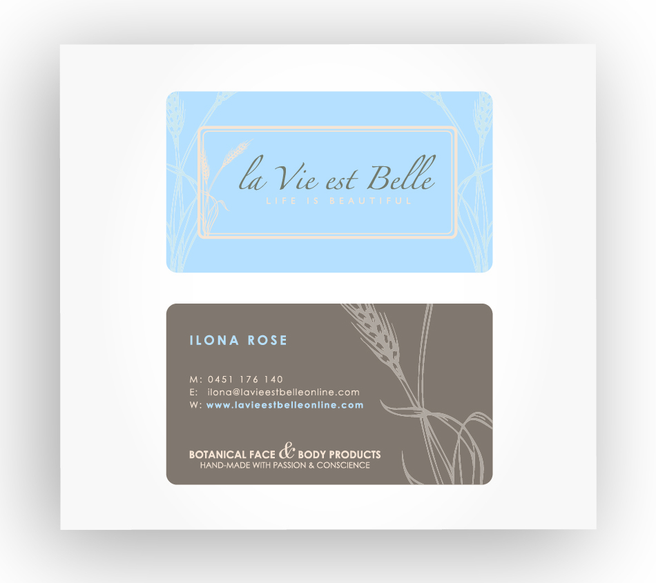
LOGO SYMBOL: Is a simple wheat image. The .ai file it can be 'pulled' out of is attached.
FRENCH TRANSLATION: The French translations of product names are to feature within the label. (Please see attached pdf's; look for the colour "stripe".)
PRODUCT DIFFERENTIATION: A unique colour is to be introduced to each product label that corresponds to the botanical ingredients found within. Ie: a light green to match Aloe Vera. That secondary colour is to feature (minimally) within that label. In the attached pdf's it's been placed as a contrasting colour stripe. Other ideas welcome. :)
BOTANICAL IMAGES: THIS IS NON-ESSENTIAL - A simple botanical image could feature on each label to correspond to the product name, instead of the colour stripe. Ie: A rosehip and rose flower on the Rosehip, Lavender and Jojoba Facial Cleanser.
COLOUR MATCHING: Each of the "secondary" colours (please see Product Differentiation) need to match each other as well as the logo colours. Some of the products are designed as combo's; ie, cleanser and moisturiser combo's. The colours for these combo's need to work together. The previous designer did a pdf of suggested secondary colours (attached), however these are mostly not in sync with the businesses' approach of earthy/simple/easy to look at/purity. A friend did a pdf of earthy green secondary colours (pdf attached entitled "La_Vie_Est_Belle_FC") and did a few creative suggestions for the label. The font, colours and design he used in the TOP LEFT label is the one I prefer but please use your creative license should you feel a different font would look better.
- LABEL INFO -
95% COMPLETED LABEL: See pdf "La_Vie_Est_Belle_FC"; top left label, product "Aloe & Lemon Myrtle Facial Cleanser". This needs the light writing at the top changed to Pantone Black 5C, and a colour decided upon for the stripe (see below for more info). The product info needs to be checked for accuracy against the word doc I've provided. (Some info has changed.) Note: All of the cleansers, moisturisers, the spray mist and the hand cream use this exact same label as above, only with a different colour stripe for differentiation and wording / title changed.
80% COMPLETED LABELS: See pdf "La Vie Est Belle_label_ v4-1":
1) "Clarifying Macadamia & Green Clay Facial Masque" needs a different colour stripe selected/inserted, the light writing above the logo needs changed to Pantone Black 5C, the font needs to be made the same as the above label "Aloe & Lemon Myrtle Facial Cleanser", and the product info updated as per the product info word doc attached.
2) "Cocoa Butter & Apricot Body Cream" need a different colour stripe selected/inserted, the font changed to the same as "Aloe & Lemon Myrtle Facial Cleanser" label, and the product info updated as per the word doc attached. The other labels on that pdf can be dismissed.
INCOMPLETE LABELS: As noted above, the "Aloe & Lemon Myrtle" cleanser label is exactly the same for 7 other products (cleansers, moisturisers, spray mist and hand cream). The "La_Vie_Est_Belle_FC" can be used as the basis for these. Each one needs a different colour stripe for differentiation chosen and inserted, and the light wording above the logo changed to Black 5C.
The products "Sandalwood & Shea Butter Facial Exfoliating Cream", "Jojoba, Ylang Ylang & Vanilla Facial Exfoliant" and "Sweet Orange & Lavender Hand & Foot Scrub" all use exactly the same labels (one for jar, one for lid) as the Clarifying Macadamia & Green Clay masque. So you should be able to replicate this label for the other products. Each of these need the light writing above the logo changed to Black 5C and the colour stripes selected/inserted.
In the pdf "La Vie Est Belle_label_ v4-1" the the 250mL bottle label has been completed. However that particular product was deleted. So using that label you can "pull out" the discontinued label wording and colour stripe, and replace it with the "Rosehip Body Lotion" label info. This also needs the light writing above the logo to be replaced with Pantone Black 5C, the colour stripe decided upon/inserted and the font to match with the above.
Only the lip balm has absolutely no work done on it. This will be just one small rectangular label.
Please note: this is not a re-branding so please stay true to the logo colours of Pantone 2717C, 4685C and Black 5C for the majority of the label. Secondary colour use is fine to match the botanicals.
Thank you so much in advance for your designs! :)
Ilona.
Aktualisierungen
Project Deadline Extended Reason: Less complexity in brief, more specifics, non-essentials removed, increase in budget to meet the scope. Added Wednesday, February 25, 2015
Zielmarkt/( -märkte)
Women aged 16 - 65+
Environmentally aware
Natural over chemical
Will spend a higher amount for a quality product
Women who want the best
Industrie/Einheitstyp
Graphic Design
Zu verwendende Schriftarten
Andere Schriftarten erwünscht:
- Attached pdf "La_Vie_Est_Belle_FC" - top left label
Sehen und fühlen
Jeder Schieber zeichnet eine der Charakteristiken der Marke des Kunden aus sowie den Stil, den euer Logo widerspiegeln sollte.
Elegant
Fett
Spielerisch
Ernst
Traditionel
Modern
Sympatisch
Professionell
Feminin
Männlich
Bunt
Konservativ
Wirtschaftlich
Gehobenes
Anforderungen
Muss haben
- Simple, clean lines, purity, natural / earthy colours.
- Secondary colours carefully chosen to reflect the botanical ingredients and to match the logo colours and each other.
- French translations on labels.
- LABELS MUST STAY WITH COLOURS MENTIONED IN BRIEF: PANTONE 2717C, 4685C, BLACK 5C - This is not a re-branding so please don't stray from using these colours for the majority of the label. (For secondary colour use to match botanicals, please use your creative license.)
Schön zu haben
- Botanical image on each label - non-essential
Sollte nicht haben
- Nothing modern, harsh, stark or intense