Redesign logo of local small market Agricultural Coop that is over 100 years old
O. K. wollte ein logo design und hat 46 Ernst, Traditionel, Agriculture logo designs von 20 Designers bekommen
Designs
Designer
Budget


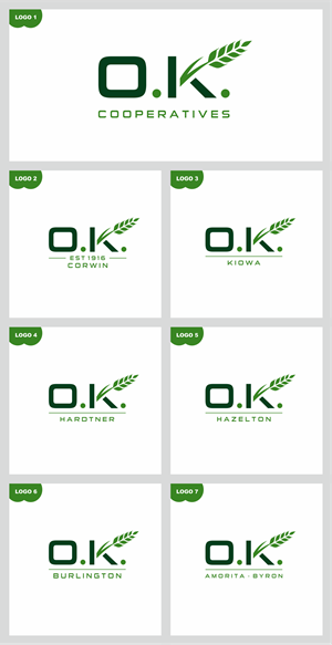

1 - 20 von 46 Logo-Designs Vorschläge
Hier ist was O. K. suchte für sein logo design.
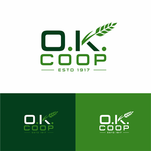
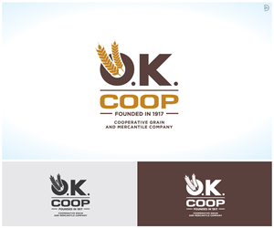
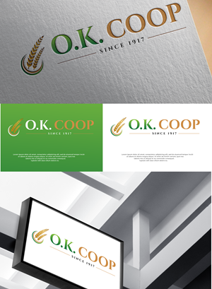
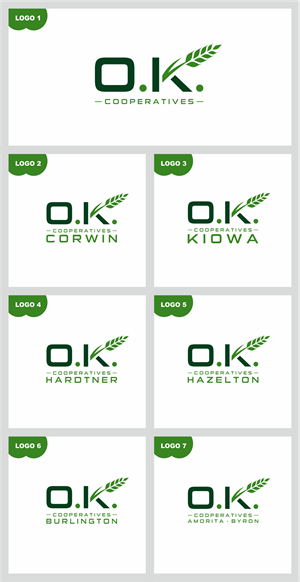
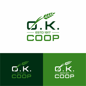
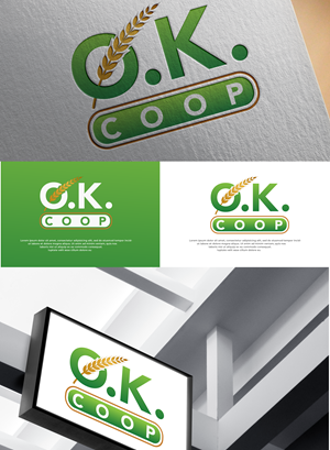
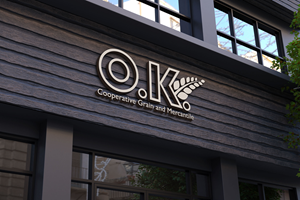
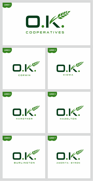
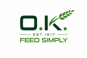
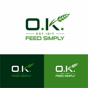
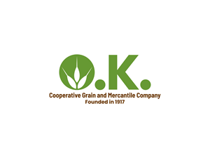
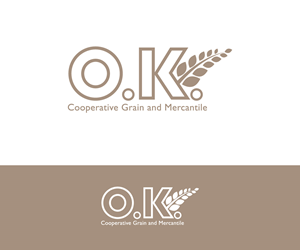
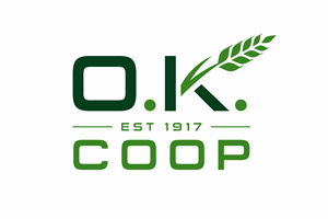
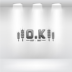
Full name of our company is O.K. Cooperative Grain and Mercantile Company, founded in 1917. O.K. means Oklahoma Kansas as we set near the border of two states. We are looking for letter head website logo that speaks to our history and our small local market or flavor... Our company is a small full service Agricultural firm that buys grain, sells crop inputs (Fertilizer - pesticide), seed, fuel, and manufactures livestock feed. We are owned by local farmers - ranchers.
We serve s small local cliental and just want to reinforce our history, and relevance to the area, our stockholders and patrons.
Farm Simply - Feed simply are some of the themes I have running in my head ... we source most inputs for our feed locally and use simple ingredients
I attached an old logo.. the current one can be found @ okcoop.com
Thinking that we want to continue to use wheat heads (grain) as a part of the logo but something cleaner than the old logo and less cartoonish …
Mehr lesen