Pharmacy Logo/Lettering Design
„Apotheke Friedenau“ or „Hirten-Apotheke“ wollte ein logo design und hat 5 Ernst, Professionell, Pharmacy, Health logo designs von 2 Designers bekommen
Designs
Designer
Budget


-
 Previous page
- You're on page 1
- Page 1 of 1
-
 Next page
1 - 5 von 5 Logo-Designs Vorschläge
Hier ist was „Apotheke Friedenau“ or „Hirten-Apotheke“ suchte für sein logo design.
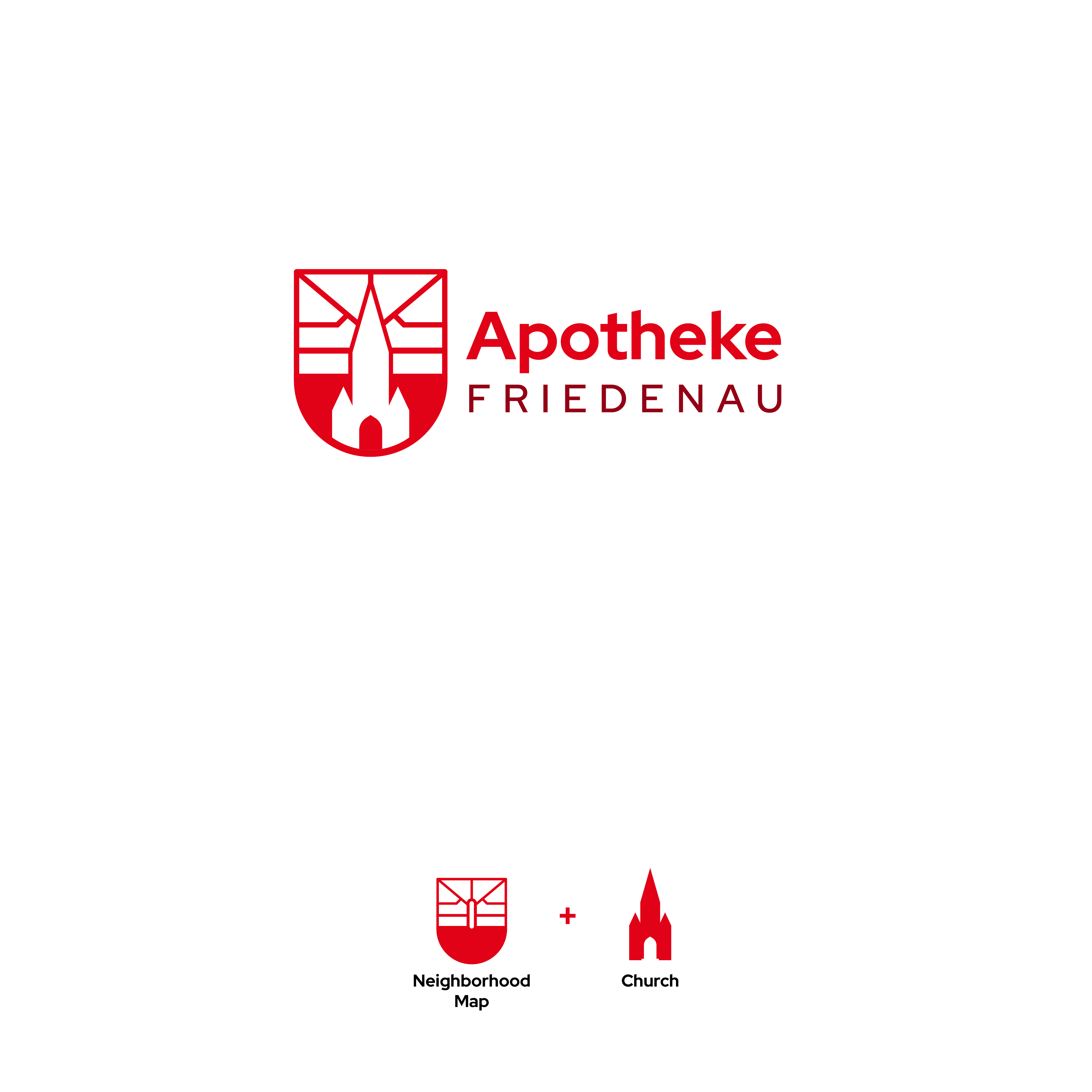
I need a logo/lettering design for an old fashioned pharmacy store in Berlin-Friedenau, an old quarter in Berlin West. The pharmacy's customers are mostly residents in the neighborhood, but a new few measures are necessary to also adress younger people and raise the pharmacy to a modestly modern standard. The quarter has a certain geometric shape, that has potential to be used in a logo (see attachments) but it is not necessary. Another point of interest in the neighborhood is the tall church („Zum guten Hirten“/„Good Shepard’s Church“) vis-a-vis to the pharmacy and placed in the middle of the former town center (picture provided).
The new name is supposed to take credit of the quarter, „Apotheke Friedenau“ or „Friedenau-Apotheke“ to represent and incorporate the neighborhood appropriately. Another possibility would be „Hirten-Apotheke“ in reference to the church.
The style can be modern/clean, serif/fractur/italic fonts or a mix of both.
Mehr lesen