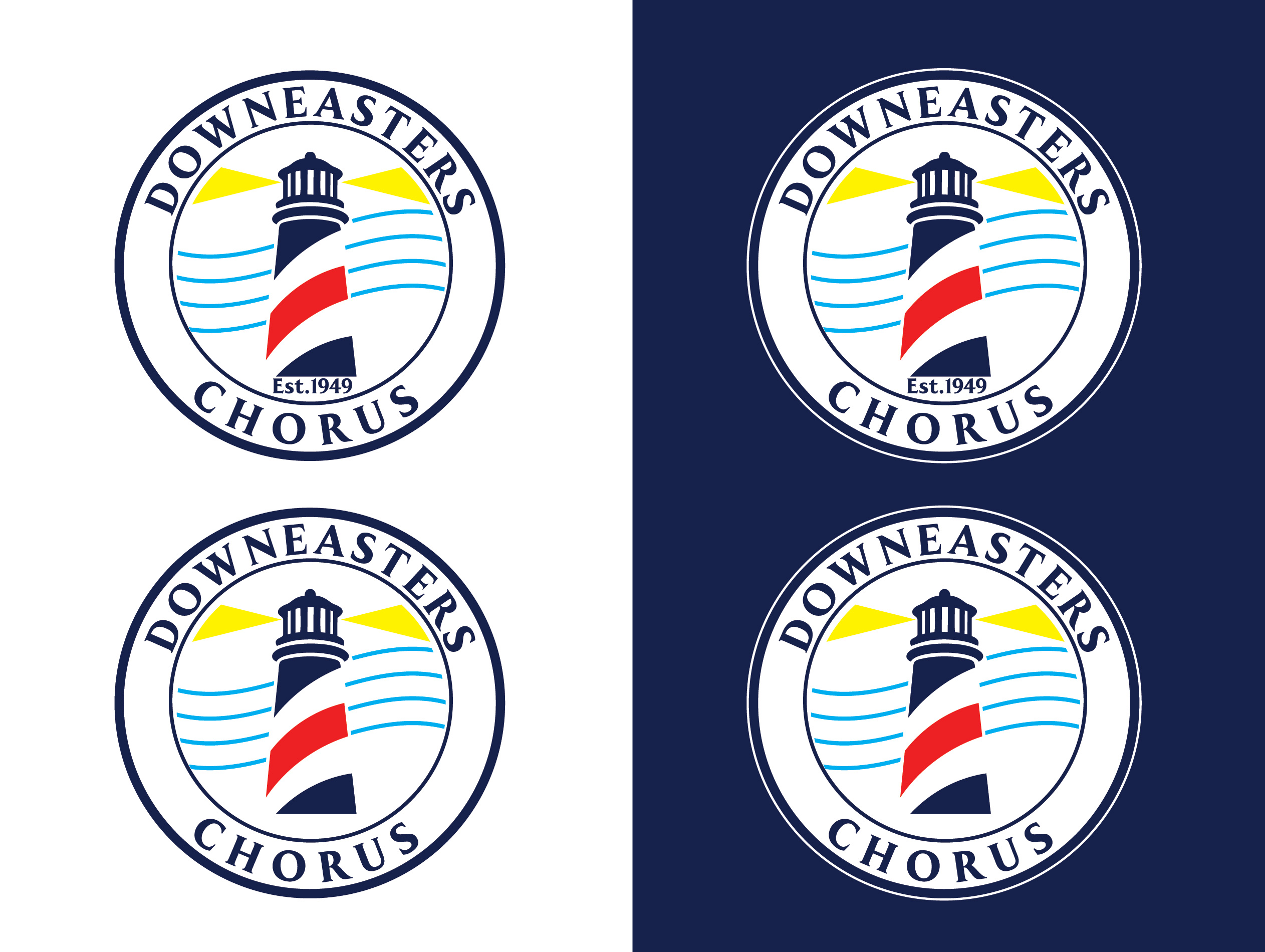
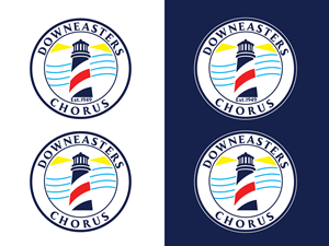
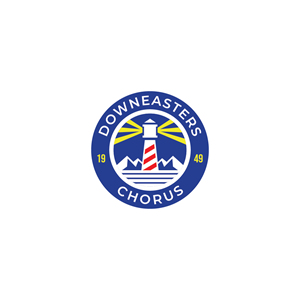
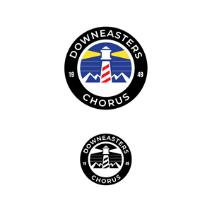
Modernizing the Downeasters Chorus Logo
Downeasters Chorus - (maybe est. 1949) but we're leaning away from that - wollte ein logo design und hat 48 Fett , Konservativ, singing logo designs von 24 Designers bekommen
Designs
Designer
Budget


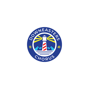
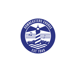
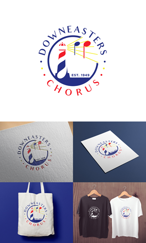

1 - 20 von 48 Logo-Designs Vorschläge
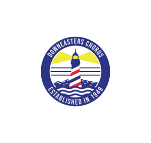
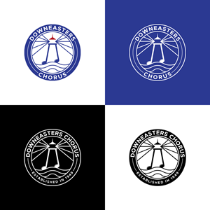
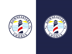
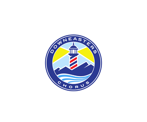
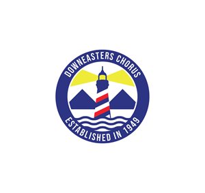
Hier ist was Downeasters Chorus - (maybe est. 1949) but we're leaning away from that - suchte für sein logo design.
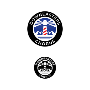
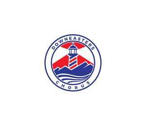
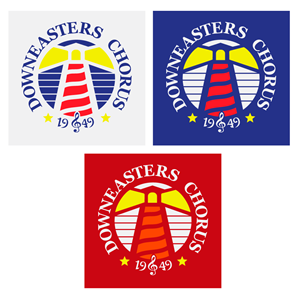
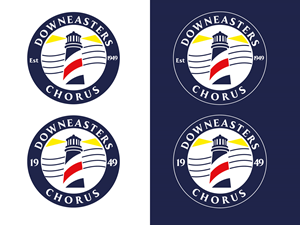
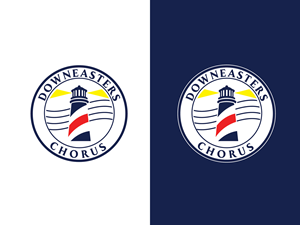
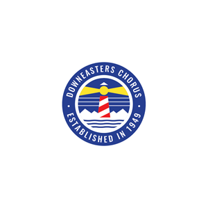
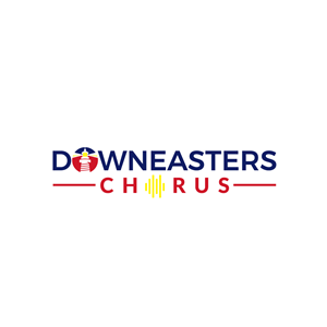
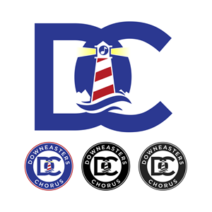
The chorus wants to modernize this logo which is seen on their website - https://www.downeasters.org/ - with the goal being to modernize and simplify while keeping the lighthouse and barberpole aspects. Should be something that can be used easily in color or BW applications, good for printing and use on apparel. Color scheme is not set in stone but i wouldn't want to stray too far from what we have already. Consider we're also buying new outfits that will be keeping the black blue red scheme we've been using the last few years. Usually this involves black pants, blue oxford shirts, red ties, black vest or coat, red accents, similar for women. I would like to use the design technique called "negative space design" or "negative space logo design." - using the empty space around or within a design element to form additional shapes or complete the overall image. I've attached the current logo and this is also on the website. We also want to highlight perhaps that the chorus is … Mehr lesen