Logo Refresh for a Superalloy Recycling Co – Keep Core, Modernise Design
Select Alloys & Materials wollte ein logo design und hat 490 Männlich, Modern, Superalloy recycling logo designs von 139 Designers bekommen
Designs
Designer
Budget


1 - 20 von 490 Logo-Designs Vorschläge
Hier ist was Select Alloys & Materials suchte für sein logo design.
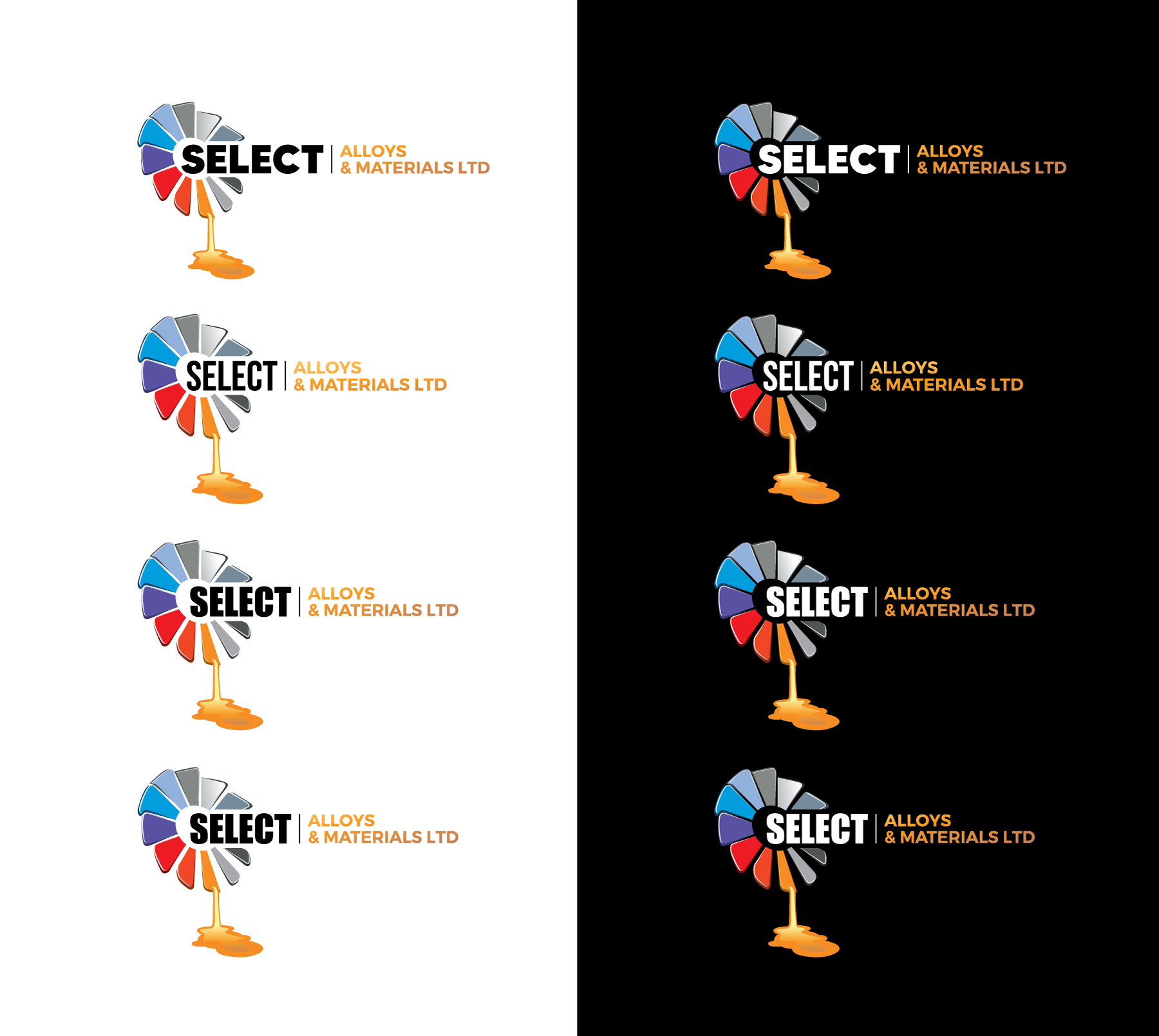
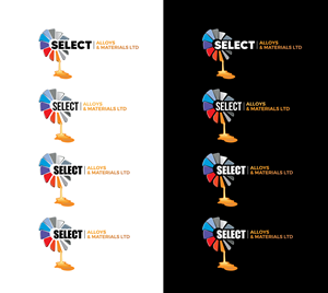
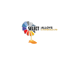
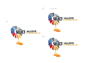
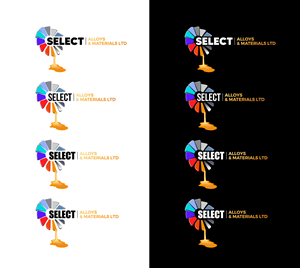
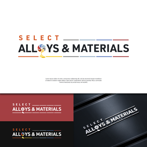
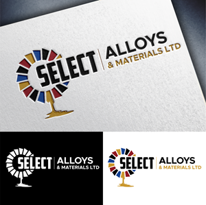
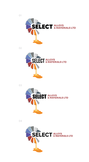
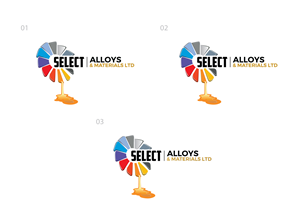
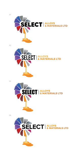
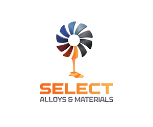
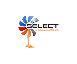
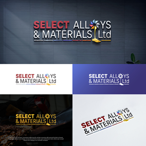
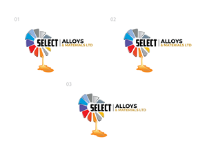
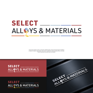
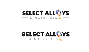
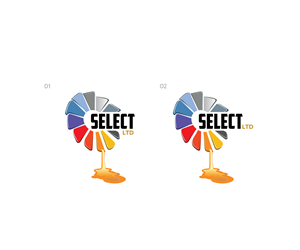
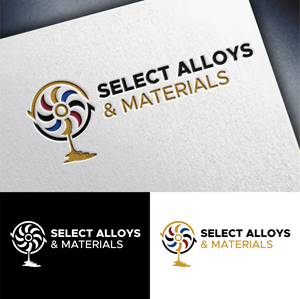
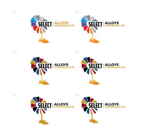
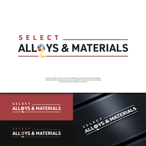
We want a refreshed version of our existing logo — not a complete change, but a modern update that keeps our recognisable logo which is a ring of angled, colourful rectangular shapes arranged in a circle with a hollow centre — one blade appears to be melting and dripping effect. The logo should feel fresher, more polished, and less flat/cartoon-like, with subtle depth or shading.
We’d like the updated icon to replace the “O” in “Alloys” within the text. The word “Select” should stand out more than the rest, with “Alloys & Materials Ltd” in a smaller or lighter style. We’d like to keep our current colour palette (mix of blues, greys, reds, and orange) but are open to text colours that complement the icon.
We’d love to see creative layout ideas, like using coloured dashes instead of a plain black line, or the drip from the icon falling into a letter in “Materials” to link the design elements.
The new design will be used for our website, paperwork, signage,…
Mehr lesen