

 Refresh
Logo Design for Danish Online Pharmacy Inspired by Traditional Apotek Signage
ditapotek.nu wollte ein logo design und hat 120 Ernst, Traditionel, Retail pharmacy logo designs von 56 Designers bekommen
Designs
Designer
Budget
 So funktioniert's


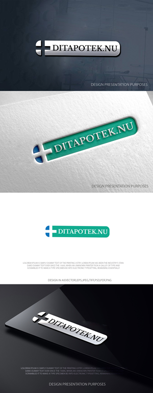






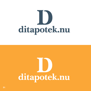


1 - 20 von 120 Logo-Designs Vorschläge
Hier ist was ditapotek.nu suchte für sein logo design.
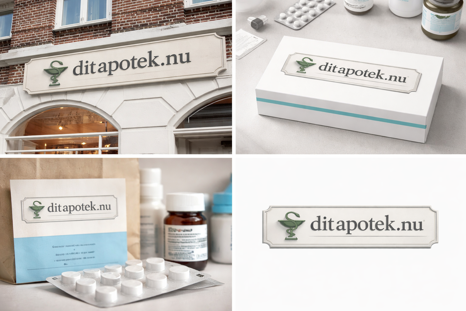
The logo must align visually with traditional Danish brick-and-mortar pharmacies (Apotek), which share a highly recognizable and consistent typographic style across Denmark.
Physical pharmacies in Denmark typically feature:
Strong serif typography
Dimensional or slightly embossed lettering
Neutral, muted color palettes
Clean, architectural presentation
A formal, authoritative tone
The objective is to create a logo for a Danish online pharmacy that feels like a natural extension of this established visual system.
It should:
Immediately signal “Danish pharmacy”
Feel legitimate and regulated
Resemble traditional Apotek signage in style
Avoid looking like a tech startup or wellness brand
Maintain simplicity and Scandinavian restraint
The logo should look as if it could realistically appear on a physical pharmacy facade in e.g. Copenhagen, while functioning effectively in a digital environment (website, mobile, packaging, pr…
Mehr lesen