

 Aktualisieren
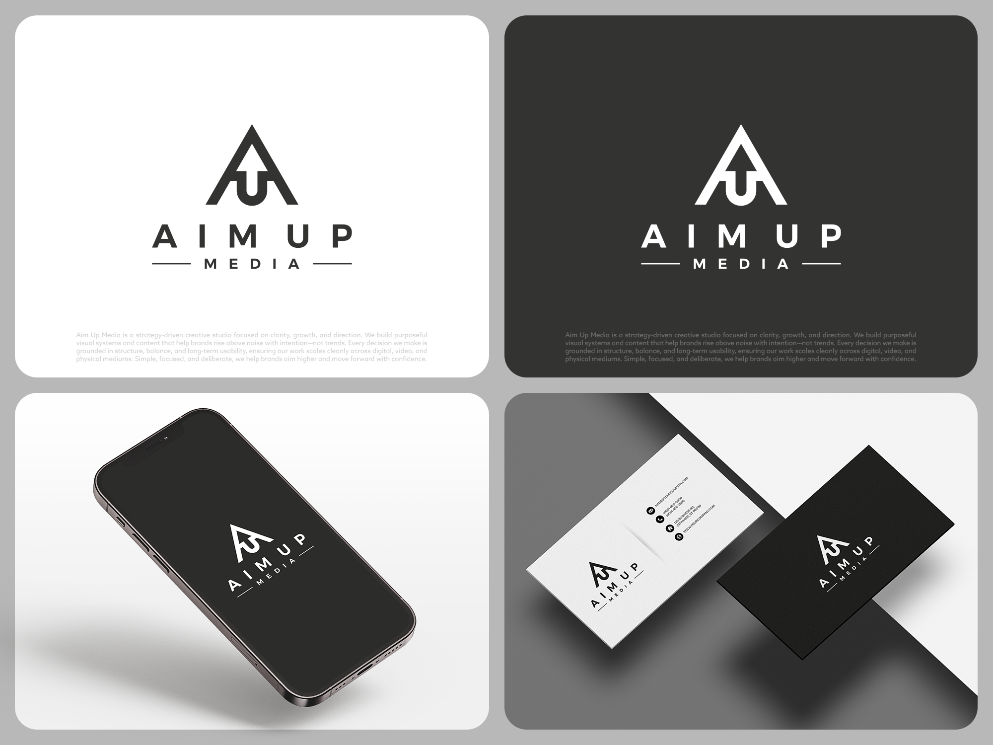
"Aim Up" Media - Logo Design
Wollen Sie auch einen Job wie diesen gewinnen?
Dieser Kunde bekam 485 Logo-Designs von 161 Designern. Dabei wurde dieses Logo-Design Design von COLOUR CREATIVE als Gewinner ausgewählt.
Kostenlos anmelden Design Jobs finden
-
 US$150
-
 485 Designs
-
 161 Designer
Logo-Design Kurzbeschreibung
Design a clean, symmetrical logo mark for “AimUp.”
The logo should integrate the letters A and U and possibly an upward arrow. The style must be minimal, geometric, and balanced, with strong symmetry and intentional line weight. Prefer a self‑contained mark (circular/square or unified shape).
The U must clearly read as a U (no ambiguous curves).
The arrow (if incorporated) must clearly read as an arrow (not an extra letter).
A subtle line separation is acceptable if it improves clarity.
Black on white.
I have uploaded a few designs i already have and that I do like, one with the A on top with a U below it and an arrow coming up from the U into the A. The other I like is the word A I M spelled vertically that looks like an arrow. I do like these but they aren't perfect but I am interested in perhaps seeing other concepts that are similar.
Avoid trends, gradients, shadows, textures, decorative fonts, or over‑abstract concepts. This should feel timeless, grounded, and finished, not clever.
The logo will be used for web, video, apparel, embroidery, and social media—so it must scale cleanly and remain legible at small sizes.
Deliver vector files (SVG/AI/EPS) plus black and white versions.
Simple. Symmetrical. Clear. Purposeful.
Logo Text
No words required, mainly just a logo mark. But a wordmark of "AIM UP" below the logo is fine, especially if its using the fonts utilized in the logo itself.
Logo Stile, die Sie interessieren können
Lettermark-Logo
Kurzwort oder Buchstaben-Logo (nur Text)



Zu verwendende Schriftarten

Sehen und fühlen
Jeder Schieber zeichnet eine der Charakteristiken der Marke des Kunden aus sowie den Stil, den euer Logo widerspiegeln sollte.


