

 Refresh
"Aim Up" Media - Logo Design
No words required, mainly just a logo mark. But a wordmark of "AIM UP" below the logo is fine, especially if its using the fonts utilized in the logo itself. wollte ein logo design und hat 245 Fett , Konservativ logo designs von 84 Designers bekommen
Designs
Designer
Budget
 So funktioniert's











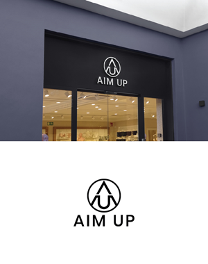


1 - 20 von 245 Logo-Designs Vorschläge
Hier ist was No words required, mainly just a logo mark. But a wordmark of "AIM UP" below the logo is fine, especially if its using the fonts utilized in the logo itself. suchte für sein logo design.
Design a clean, symmetrical logo mark for “AimUp.”
The logo should integrate the letters A and U and possibly an upward arrow. The style must be minimal, geometric, and balanced, with strong symmetry and intentional line weight. Prefer a self-contained mark (circular/square or unified shape).
The U must clearly read as a U (no ambiguous curves).
The arrow (if incorporated) must clearly read as an arrow (not an extra letter).
A subtle line separation is acceptable if it improves clarity.
Black on white.
I have uploaded a few designs i already have and that I do like, one with the A on top with a U below it and an arrow coming up from the U into the A. The other I like is the word A I M spelled vertically that looks like an arrow. I do like these but they aren't perfect but I am interested in perhaps seeing other concepts that are similar.
Avoid trends, gradients, shadows, textures, decorative fonts, or over-abstract concepts. This …
Mehr lesen