Metro UI Style Web Application Design
Wollen Sie auch einen Job wie diesen gewinnen?
Dieser Kunde bekam 32 Web-Designs von 4 Designern. Dabei wurde dieses Web-Design Design von Hype4 als Gewinner ausgewählt.
Kostenlos anmelden Design Jobs finden- Garantiert
-
 US$500
-
 32 Designs
-
 4 Designer
Web-Design Kurzbeschreibung
Our organisation are currently building a new cloud based digital asset management web application. The application will allow users to upload many images, videos, and other media types and manage them in the cloud.
Our typical clients are mid-large sized enterprises (usually with more than 250 employees), but our typical users are marketing teams, graphics designers, web designers and press contacts. The design provided should be tailored to our users, not necessarily the enterprise they work for.
We are looking for a designer to come up with the design for a few key pages within the site based loosely around the Metro UI Style created for Windows Phone and Windows 8. Some examples of Metro UI in action can be found here:
http://www.fuelyourcreativity.com/10-designs-inspired-by-microsofts-metro-ui/
We particularly like the cleanliness of the design and the focus on typography. The Windows 8 "homepage" also encapsulates the Metro Ui concepts nicely, and we're sure you will have seen many other examples. Check out the Windows 8 App Store to see many real world use cases for the designs.
The pages that we would like to see in the design are as follows:
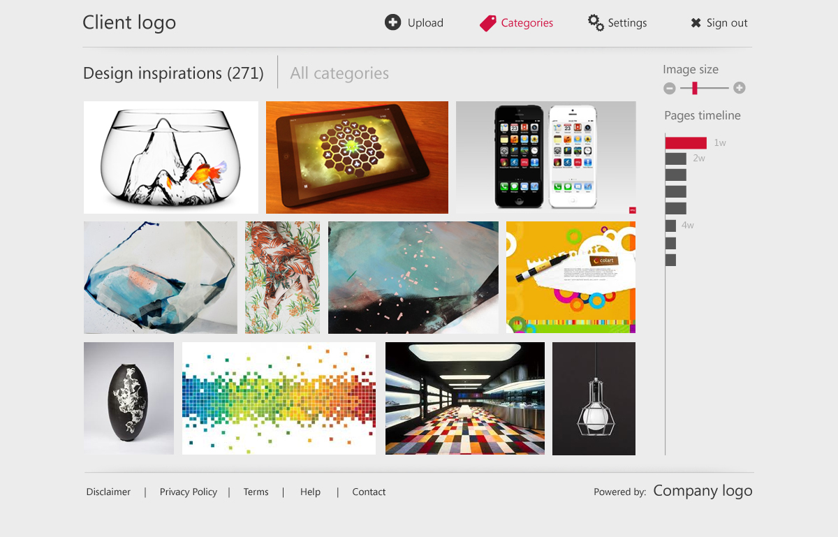
1. The homepage
The homepage of our software is what will be seen by the client once they have logged into the system. This page should include a number of "widgets" or "components". These include the following:
- Login name with login status
- A visual representation of at least 5 featured images, with 1 image receiving the main focus
- Links to all of the image categories
- Links to user functionality such as "upload image(s)", "settings" and "Sign out"
- A visual representation of most used "tags" on the site - this could be a tag cloud, or something more in line with the metro concepts
- A visual representation of recently viewed assets
- Space for our companies logo (not yet designed so a placeholder should be used) - this shoudlnt' be the main focus and should be small (maybe in the footer)
- Space for our clients logo (this should be the primary logo on the page, maybe appearing in the top left hand corner)
2. The view asset page
- For the purposes of the design, assume that an asset is an uploaded image
- This page should use the same chrome as the homepage (chrome = common website components such as logo, navigation and login status)
- The asset/image should take up the majority of the screen size, which will be dynamically resizable
- to the right of the image there should be a metadata "bar" of information that will include metadata about the image such as author, uploaded date, file type, file size etc.)
- the metadata "bar" should be expandable/collapsible based on what the users wants to see - this should be reflect in the design
- underneath the image there should be several actions that a user can complete against the image. It is up to you how these are conveyed, but we think that an icon and label for each is probably a good bet, but we're open to suggestions. The actions are as follow:
- download image (this will have a drop down menu so this should be indicated, maybe with an arrow pointing downwards?)
- edit image
- rate image (maybe shown as a rating control?)
- add tag to image
- add comment to image
3. The view category page
- This page displays all of the assets/images in a given category
- We really like the concept shown here http://blogs.msdn.com/b/b8/archive/2012/06/26/introducing-the-photos-app-for-windows-8.aspx (2nd picture down)
- users should be able to change the size of the images on the page (and thus changing the number of images displayed)
- a paging mechanism needs to be designed that will allow the user to page between screens - in an ideal world we would have similar paging to an ipad app (eg small dots that represent each page with the current page being slightly brighter). This removes the need for "page numbers". To be clear we don't like the "scroll horizontally to page" functioanlity that is common in the metro UI
- please feel free to add your own twist on this page
The above 3 pages are REQUIRED for every design, but you may submit additional pages if you think they will benefit your design (for example settings pages, other UI elements, login pages, etc.)
If required please also submit a textual description of the functionality found on each page - for example if something is not clear from the flat design images.
Zielmarkt/( -märkte)
The target users of this application will be marketing teams, website designers, graphic designers and press
Industrie/Einheitstyp
Marketing
Sehen und fühlen
Jeder Schieber zeichnet eine der Charakteristiken der Marke des Kunden aus sowie den Stil, den euer Logo widerspiegeln sollte.